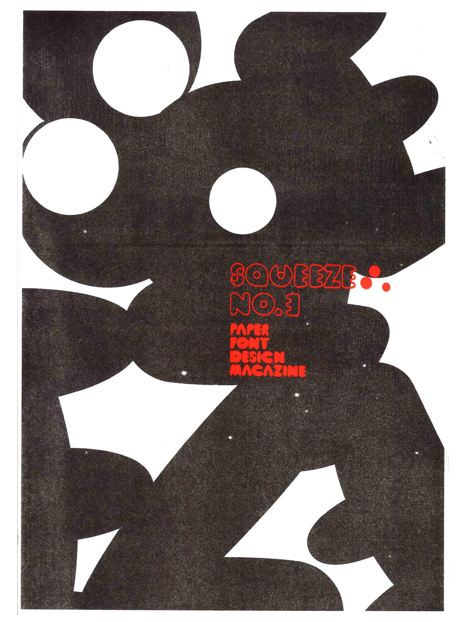
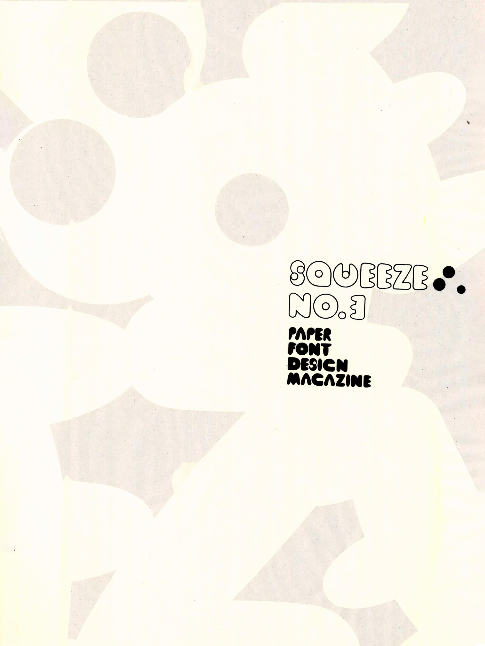
Approached by
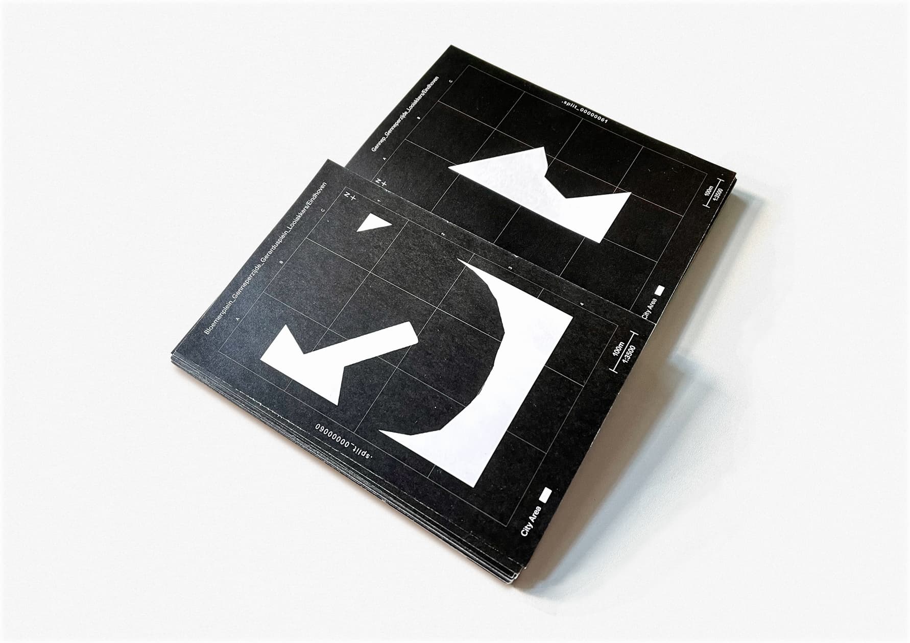
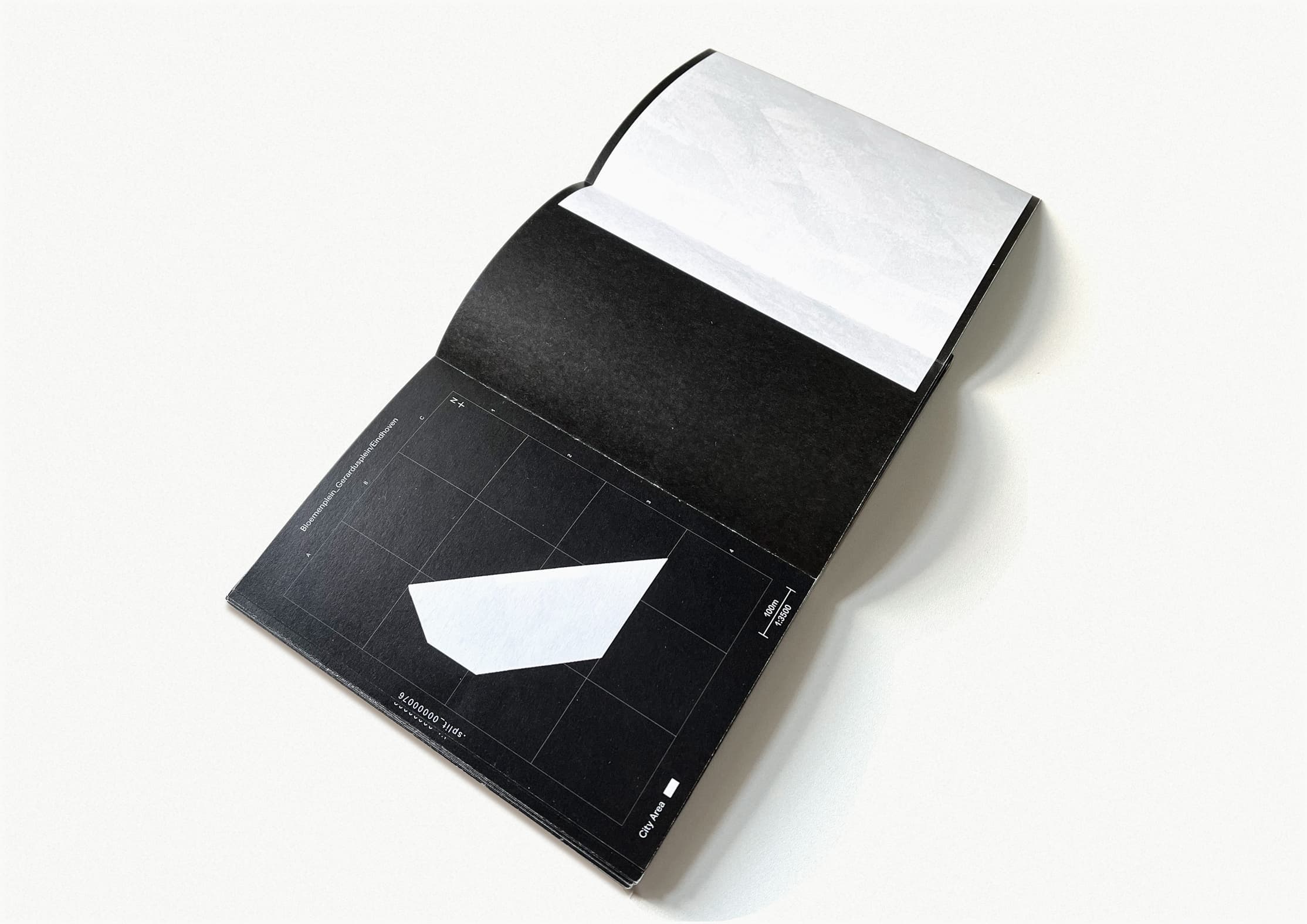
Quad Fine Arts
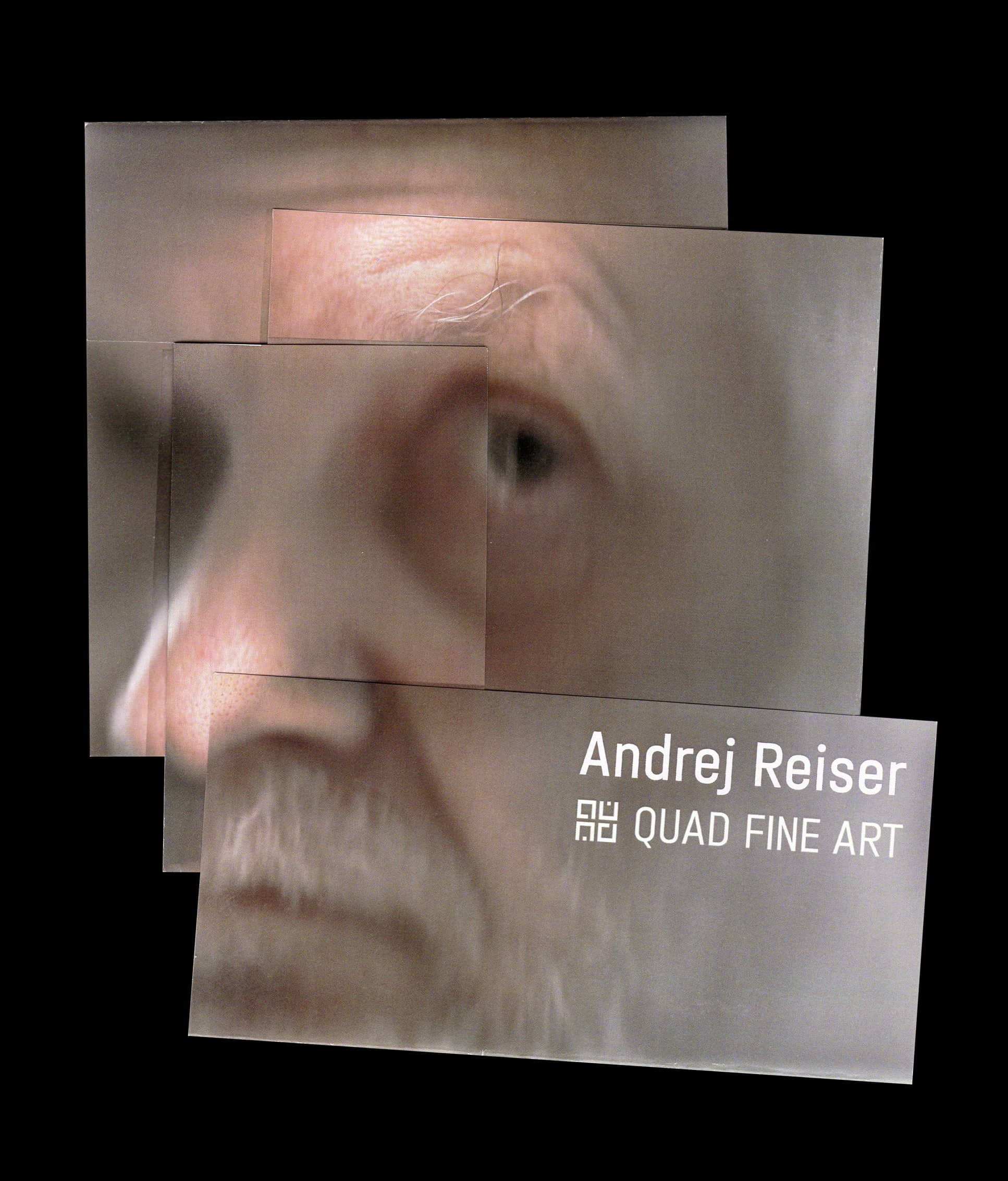 to design a pamphlet
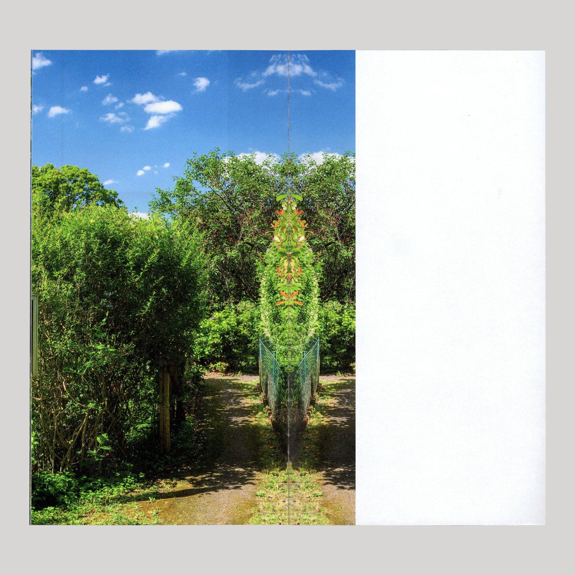
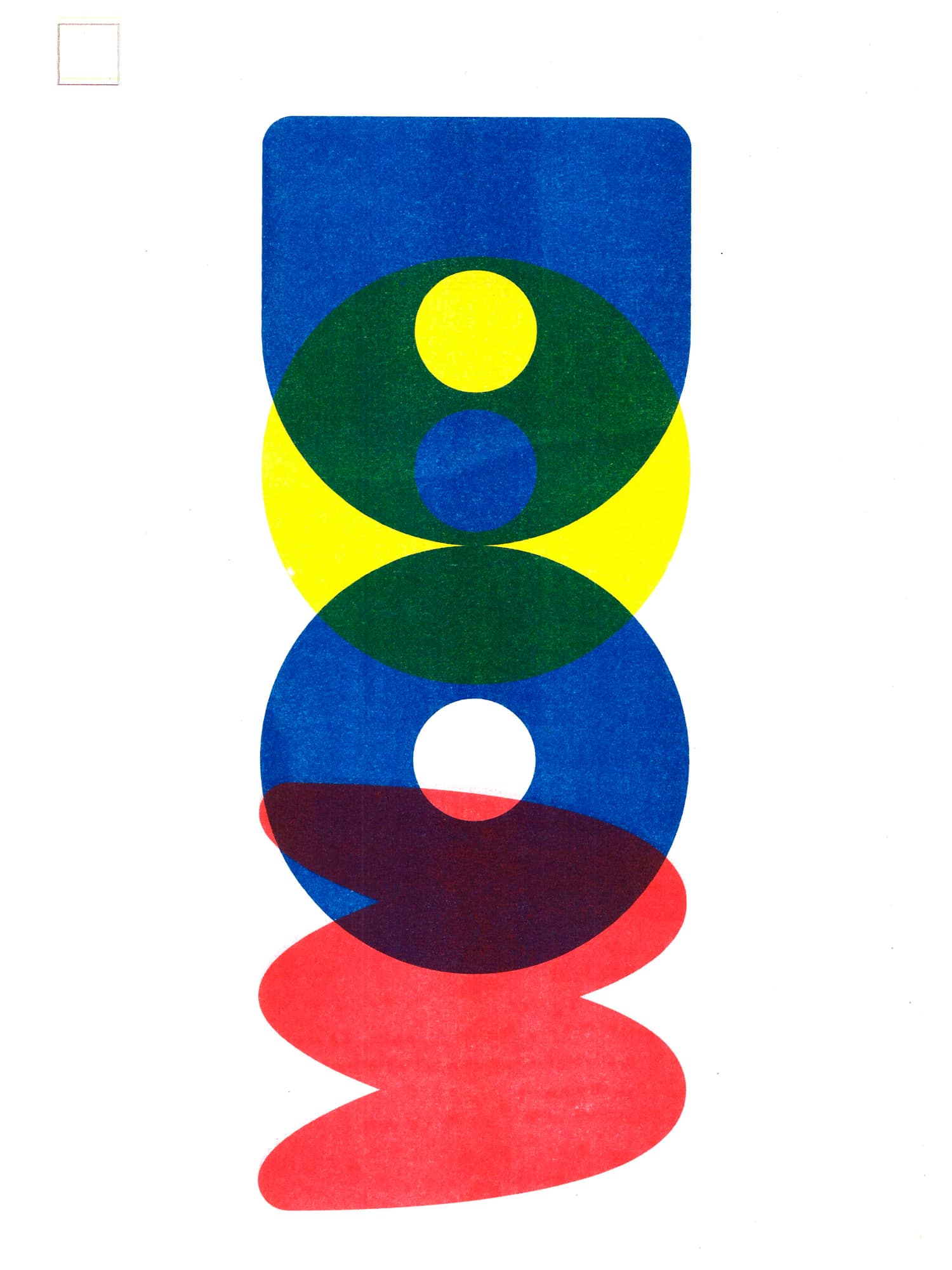
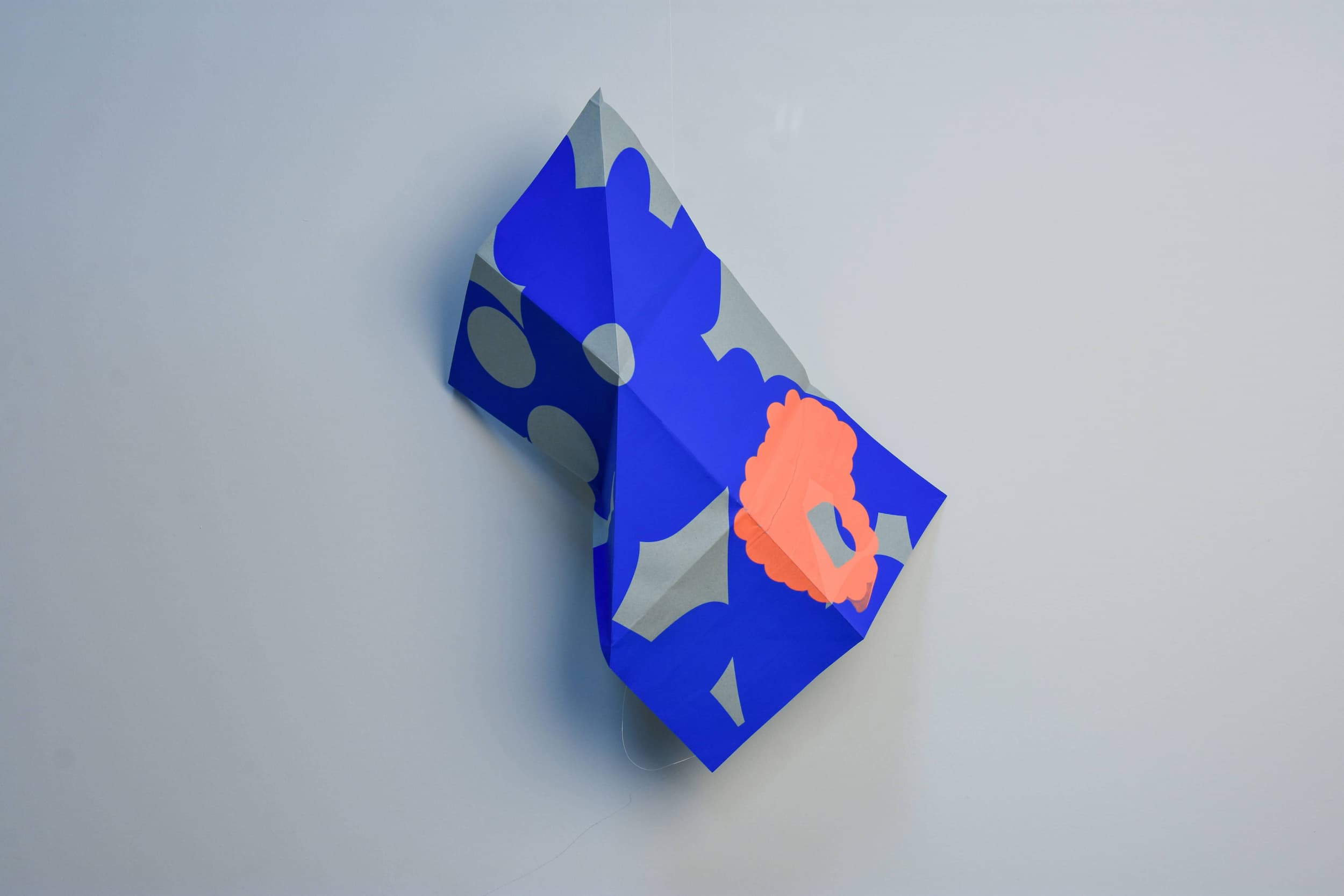
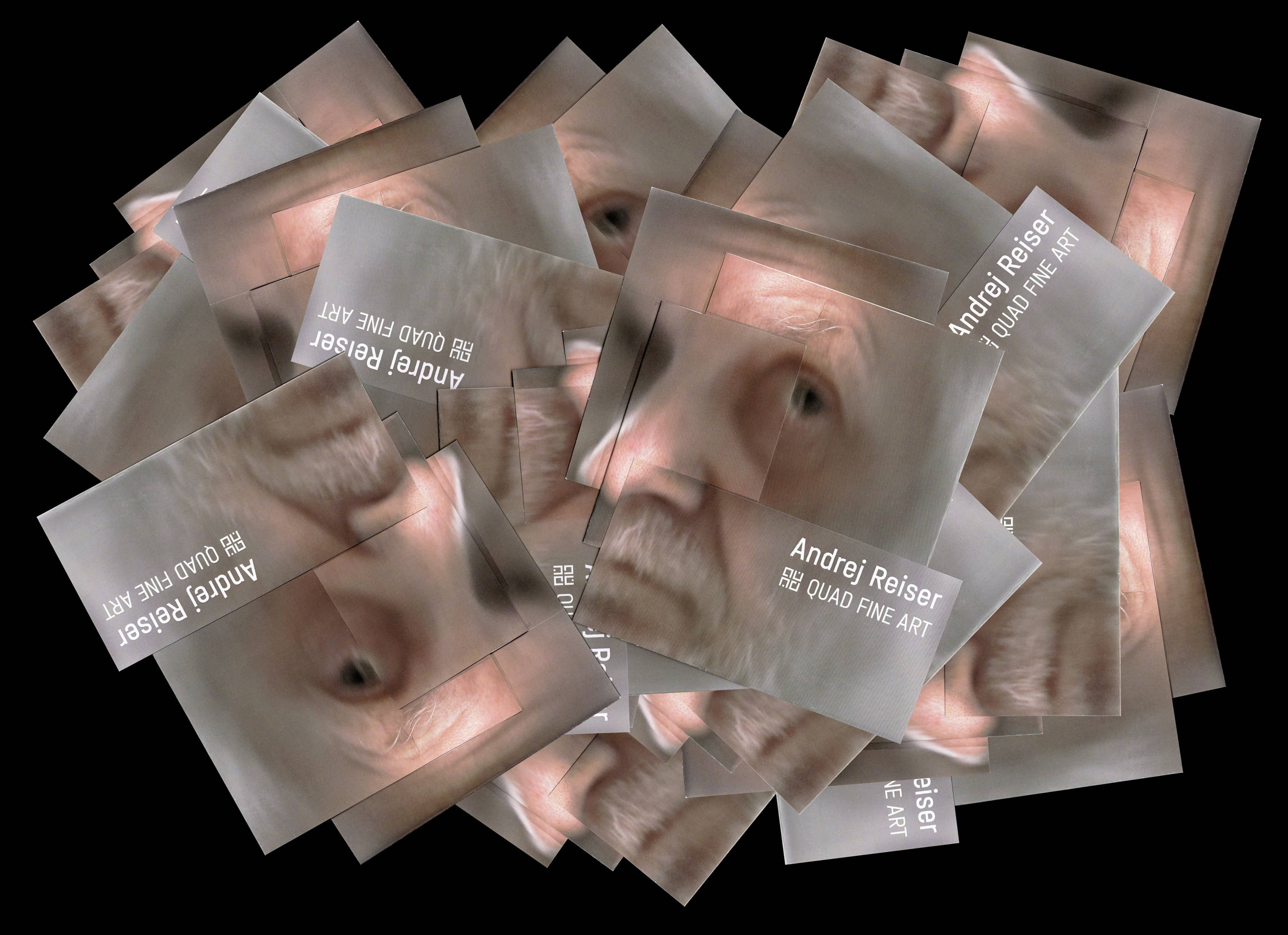 announcing their representation of photographer Andrej
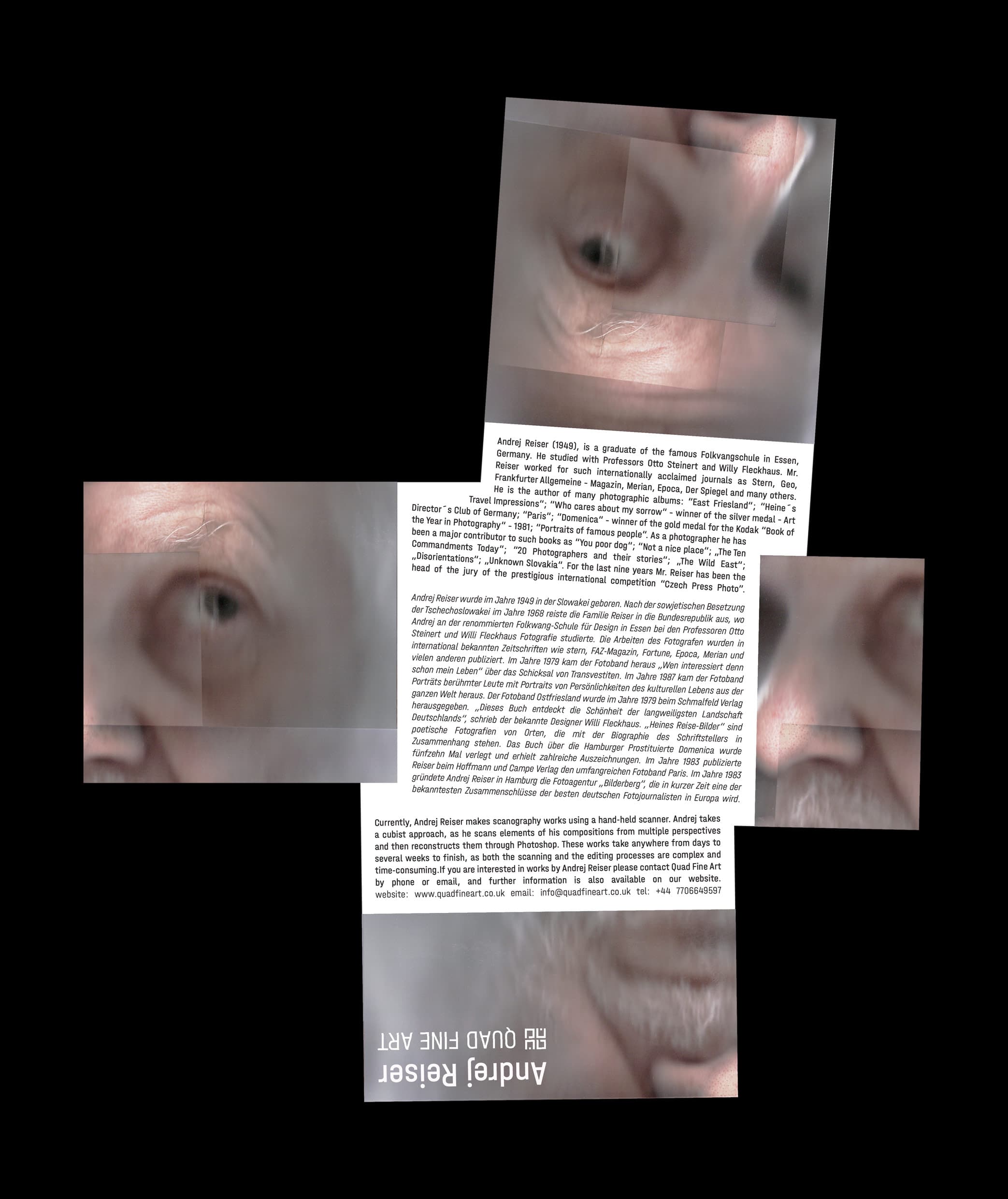 Reiser. The booklet was inspired by
 Reiser's
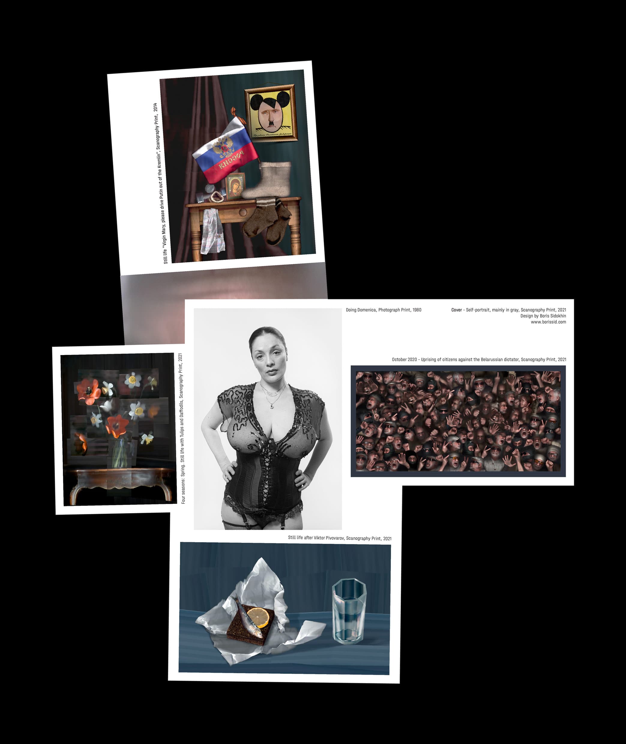
unique scanography prints.
(the amazing original work 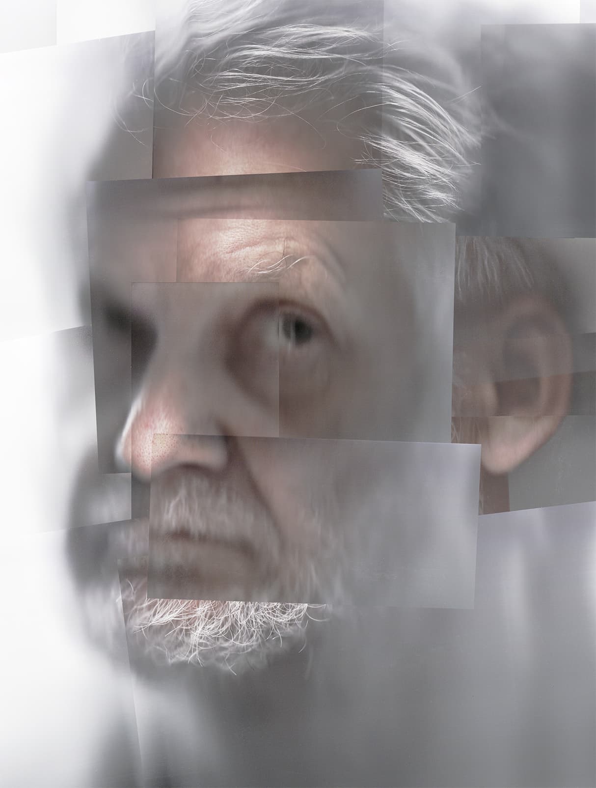 the pamphlet was based on)
Work Experience
2024 Head Graphic Designer at YC gGmbH Medien und Bildung, Agency for Media Education, Digital Competencies, Media Production
2024 Freelance Graphic Designer at Anytype, Software Company
2023 Freelance Graphic Designer at Quad Fine Arts, Modern Fine Art Gallery
2022 Freelance Book Designer at Circadian Books, Publishing House
2022 Graphic Design Intern at backbonebooks, Book Design Agency
2022 Graphic Design Intern at hesign International, Graphic Design Agency
Education
2023 Bachelor at Design Academy Eindhoven
2019 International Baccalaureate Diploma at Dresden International School



 of the company in a way that would still be recognizable to their old
clientele, Saxon schools, and the
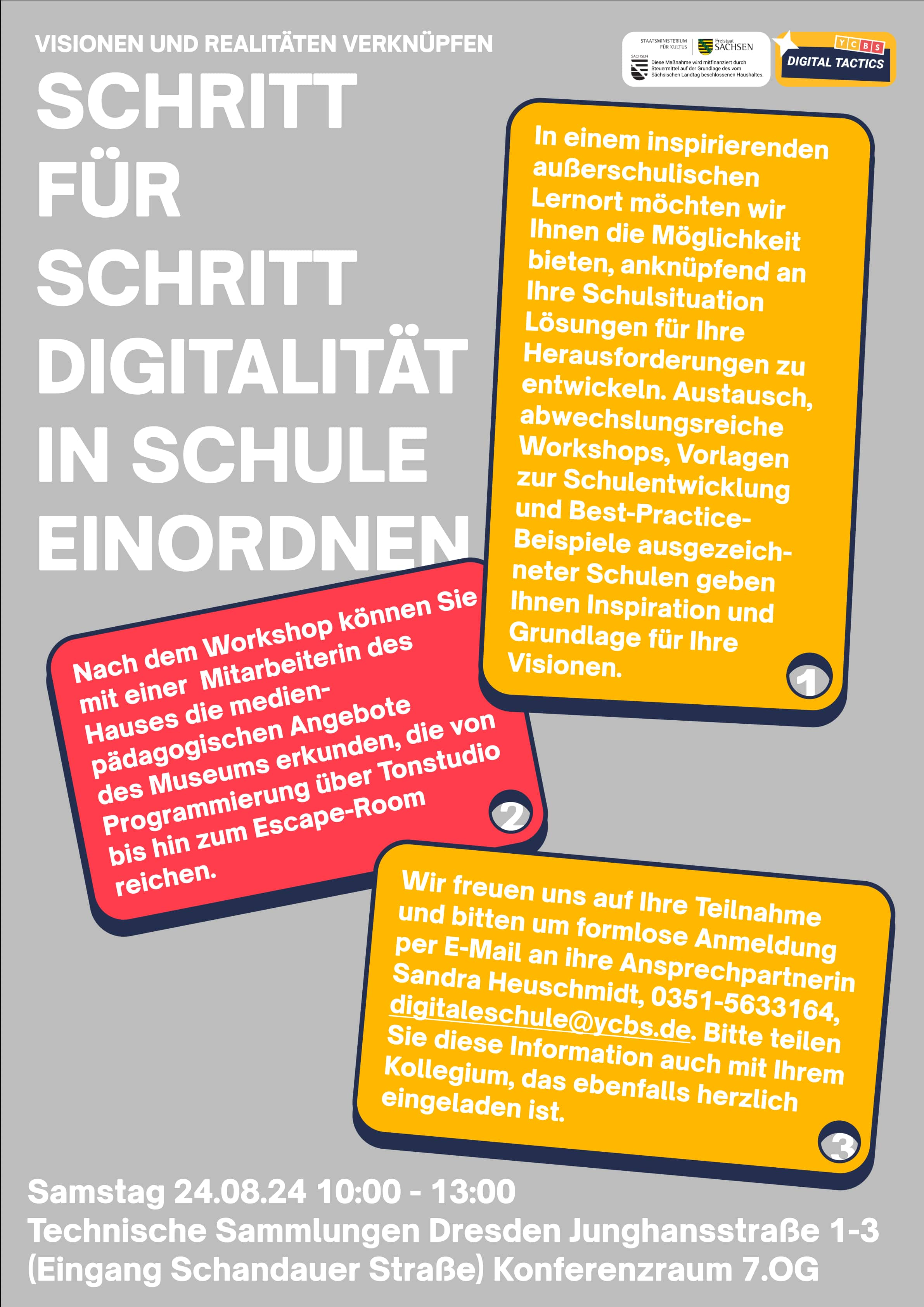 Saxon State Ministry for Education, while simultaneously appealing to diverse audiences from children to educators. As a
result, I created a flexible visual system based on the rectangles
from their previous logo
 .
.
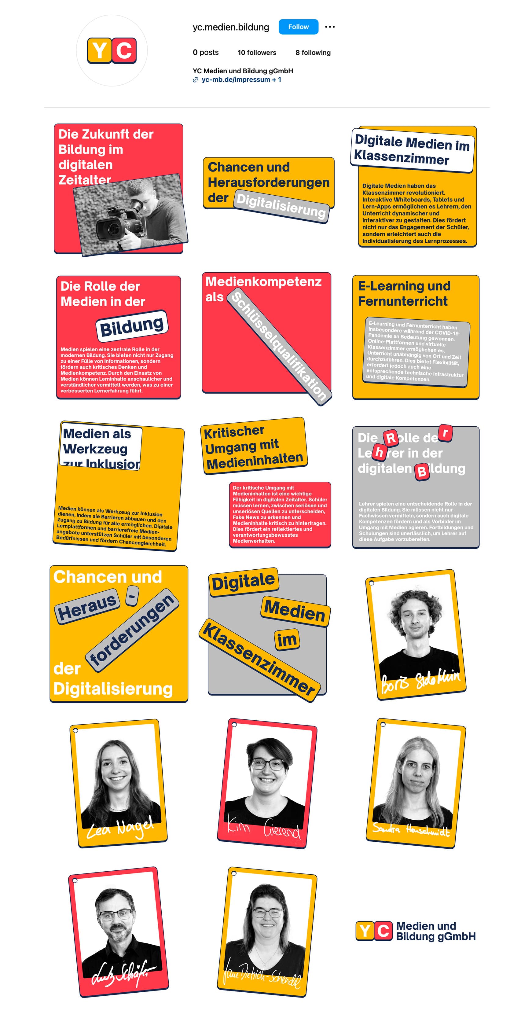 that the design must contain, and the different places and formats that
the design must be applied to, the visual identity had to be quite simple
and variable whilst, of course, still being distinguishable
as the visual identity of YC. As such, the rectangles inherited from the
original logo, serve as the fundamental building blocks of the visual
system
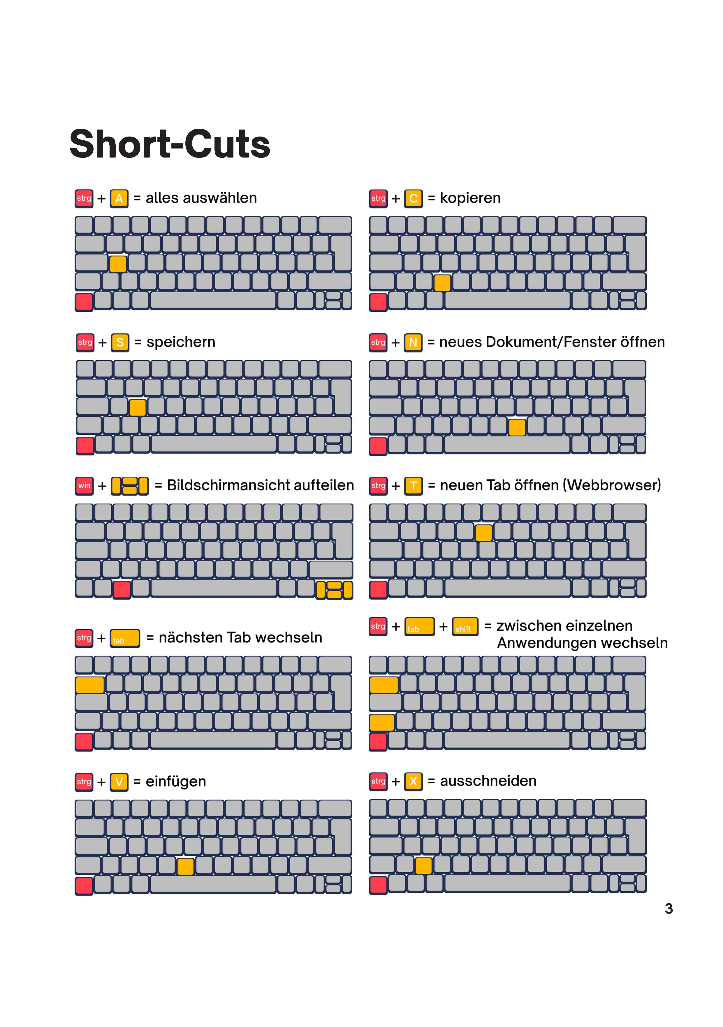 , as their versatile form allows for the seamless integration of virtually
any content without appearing out of place.
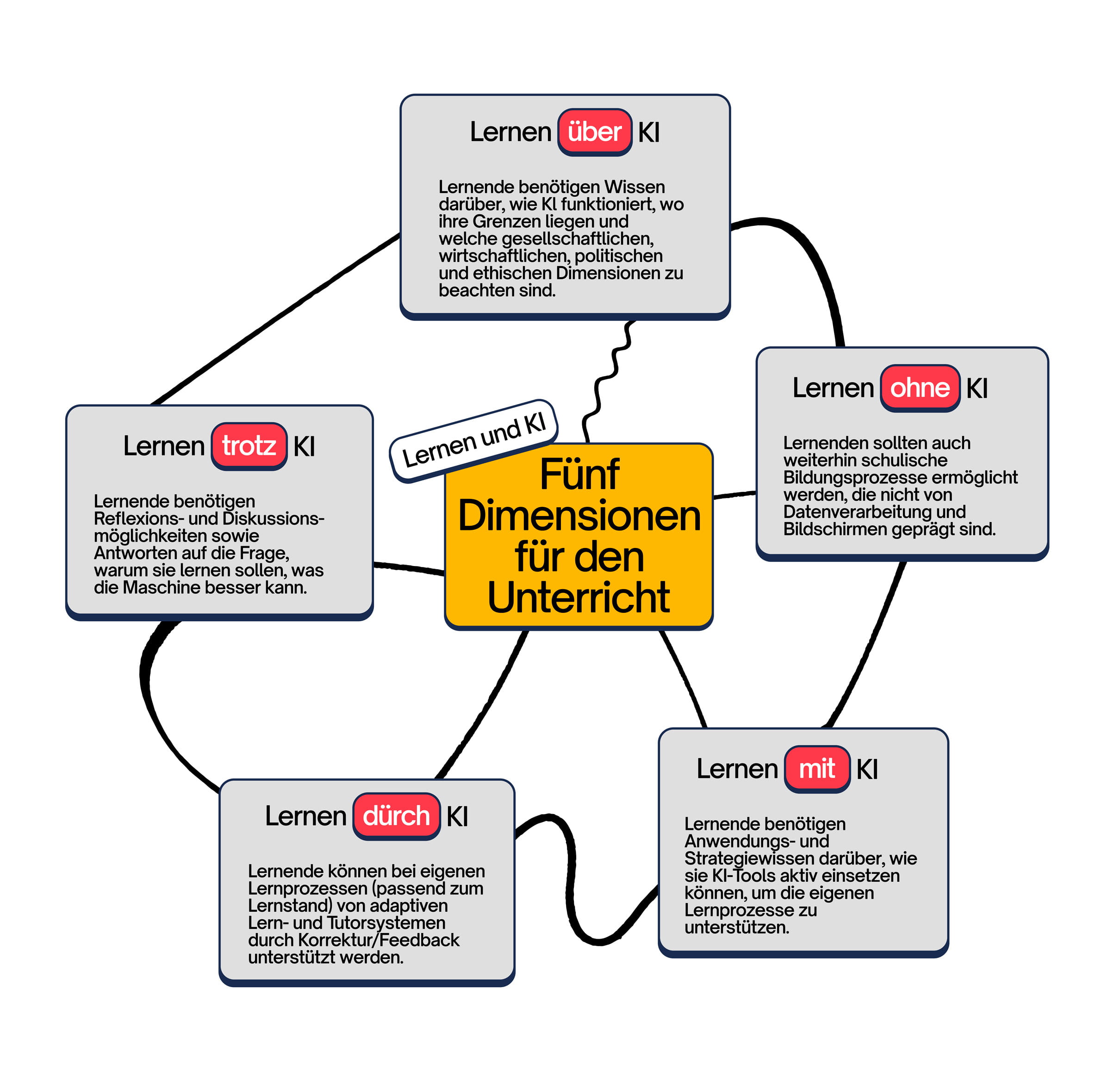 where the rectangular elements act like abstract magnets that can be
freely arranged to display information
. Furthermore, the rectangles can escape the two-dimensional constraints,
with the ability for these magnets to stick on top of each other.
 This is not only used as a method to establish a clear information
hierarchy, but also a way to create quite distinctive visual arrangements.
/1. 53163380721_e7503bfd88_o.jpg) overview of the internet today, whilst offering insights
overview of the internet today, whilst offering insights
/2. 53163812485_8c90d609c0_o.jpg) into possible alternatives to the current internet structure.
into possible alternatives to the current internet structure./3. Abby pics (BS edit)-40.jpg) has not quite become what its early pioneers had intended
has not quite become what its early pioneers had intended
/4. Abby pics (BS edit)-25.jpg) it to be, as it has materialized into a medium that doesn't support an
interconnected way of thinking, which would otherwise benefit
it to be, as it has materialized into a medium that doesn't support an
interconnected way of thinking, which would otherwise benefit
/5. Abby pics (BS edit)-42.jpg) creativity and ingenuity. Fortunately, alternatives that do go in the
direction of the visions of early internet pioneers, are being developed today.
creativity and ingenuity. Fortunately, alternatives that do go in the
direction of the visions of early internet pioneers, are being developed today.
/6. Abby pics (BS edit)-41.jpg) that people in our social surroundings also did not know how the internet was
structured or even looked
that people in our social surroundings also did not know how the internet was
structured or even looked
/7. Abby pics (BS edit)-44.jpg) like. Furthermore, after attempting to research this topic, we realised that
there is no explanation of how the internet is structured that is tangibly
understandable and visually enticing for design
like. Furthermore, after attempting to research this topic, we realised that
there is no explanation of how the internet is structured that is tangibly
understandable and visually enticing for design
/8. Abby pics (BS edit)-38.jpg) students. And as upcoming professionals whose practice is evermore intertwined
and reliant on the technology of the internet, how can we know which
students. And as upcoming professionals whose practice is evermore intertwined
and reliant on the technology of the internet, how can we know which
/9. Abby pics (BS edit)-43.jpg) directions and alternative structures are worth supporting if the mental image of
the structure is so fractured, imperceptible, and unexplained?
directions and alternative structures are worth supporting if the mental image of
the structure is so fractured, imperceptible, and unexplained?/10. Abby pics (BS edit)-30.jpg) architectural overview of the internet structure today, whilst introducing readers
to possible alternatives
architectural overview of the internet structure today, whilst introducing readers
to possible alternatives
/11. Understanding-Internet_Consumer_18-04.jpg) to the Internet that have real potential to improve the creative process of
designers. This project tries to enthuse people on the topic of the internet
to the Internet that have real potential to improve the creative process of
designers. This project tries to enthuse people on the topic of the internet
/12. Abby pics (BS edit)-46.jpg) and gives an access point to further exploration beyond the scope of the
publication and subsequent installation.
and gives an access point to further exploration beyond the scope of the
publication and subsequent installation.
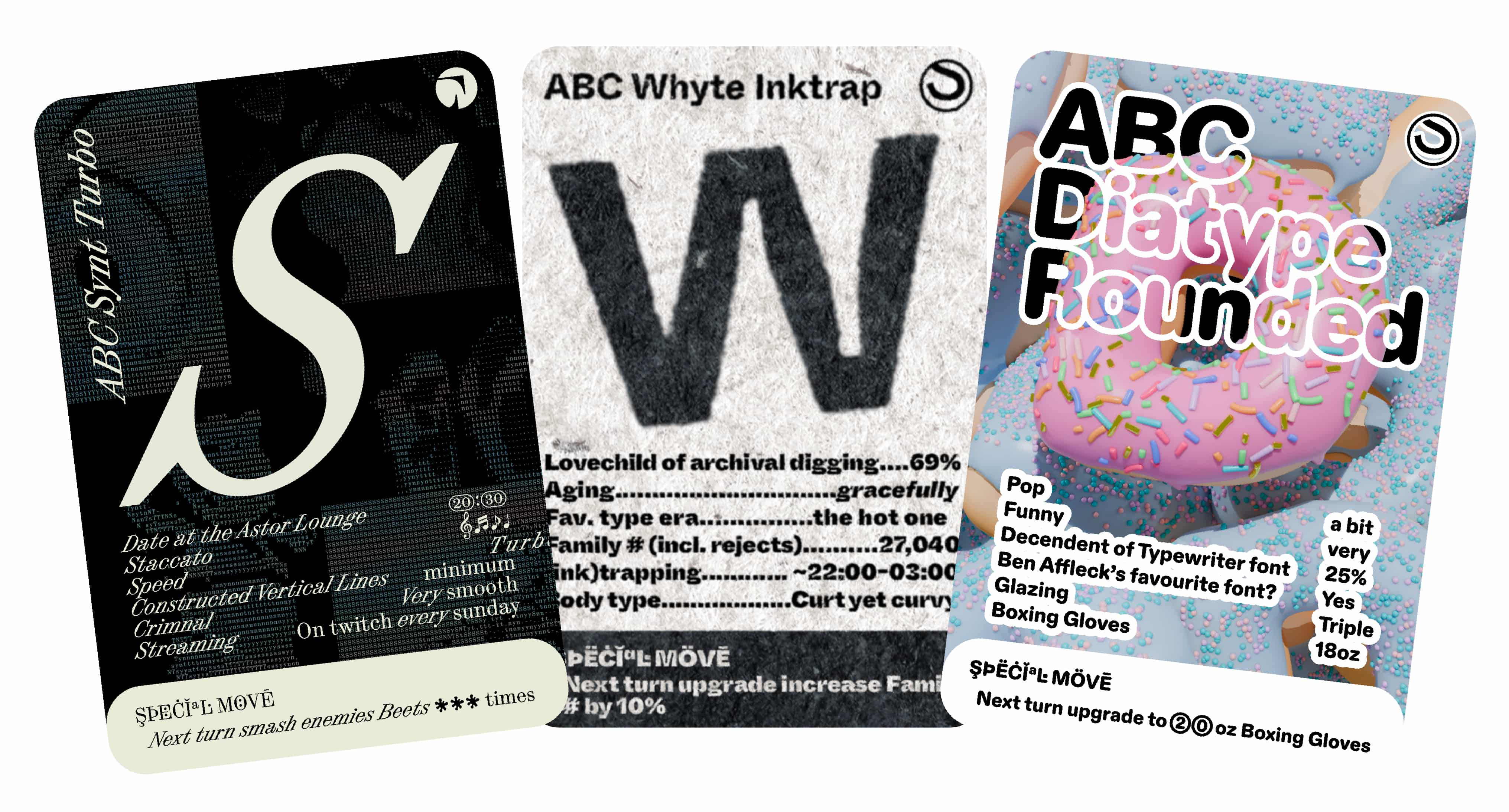 Dinamo Font Cards are collectible trading cards based on Dinamo's
typeface catalogue. Fitting into Dinamo's
"hardware" collection, the cards offer fans an engaging way to inform
Dinamo's fans about the special character(s) and traits of each
typeface.
 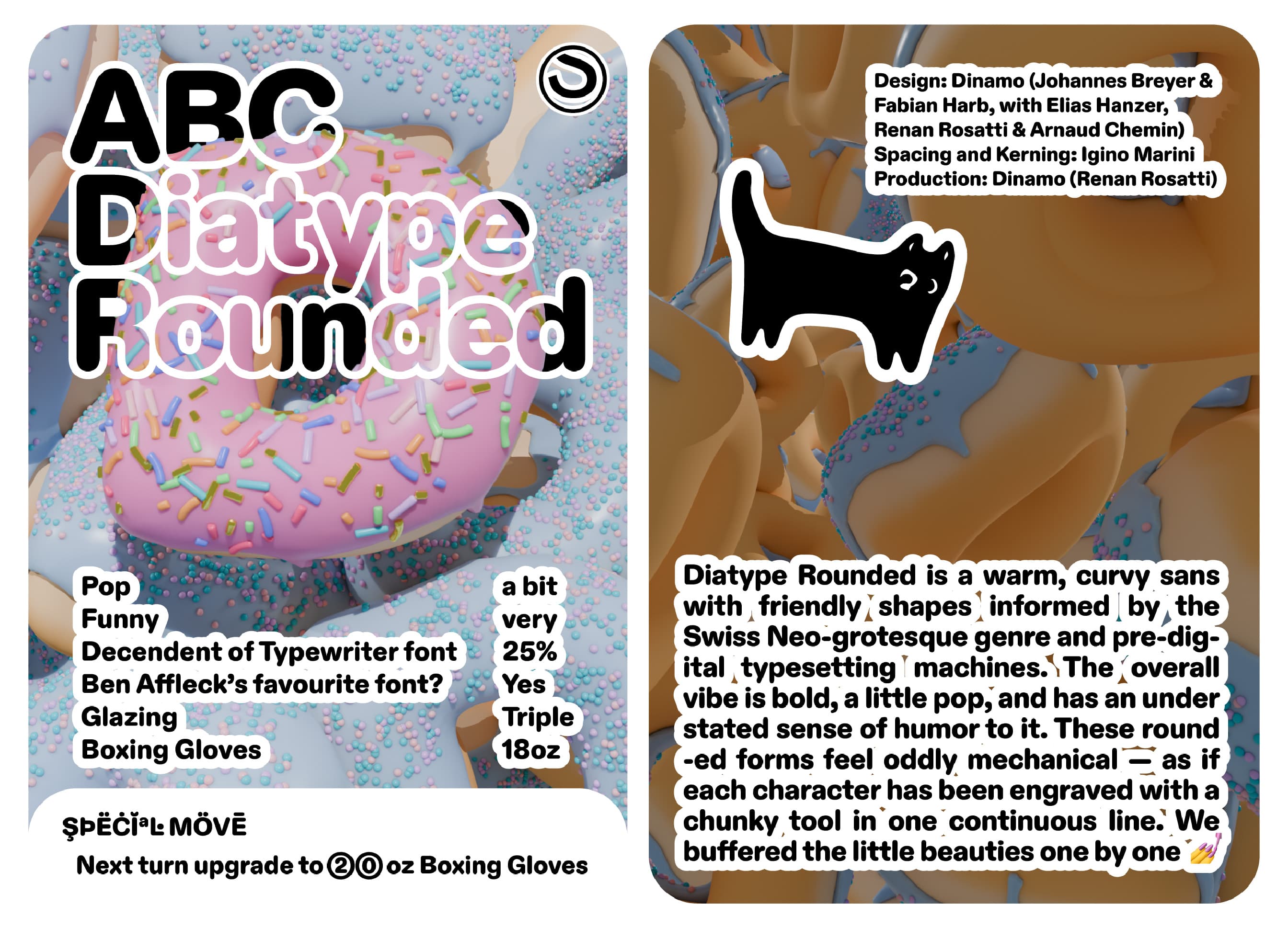 cultural significance, inspiration, history, and more. These cards serve as
a tangible extension of the blog that accompanies the release of each
typeface.
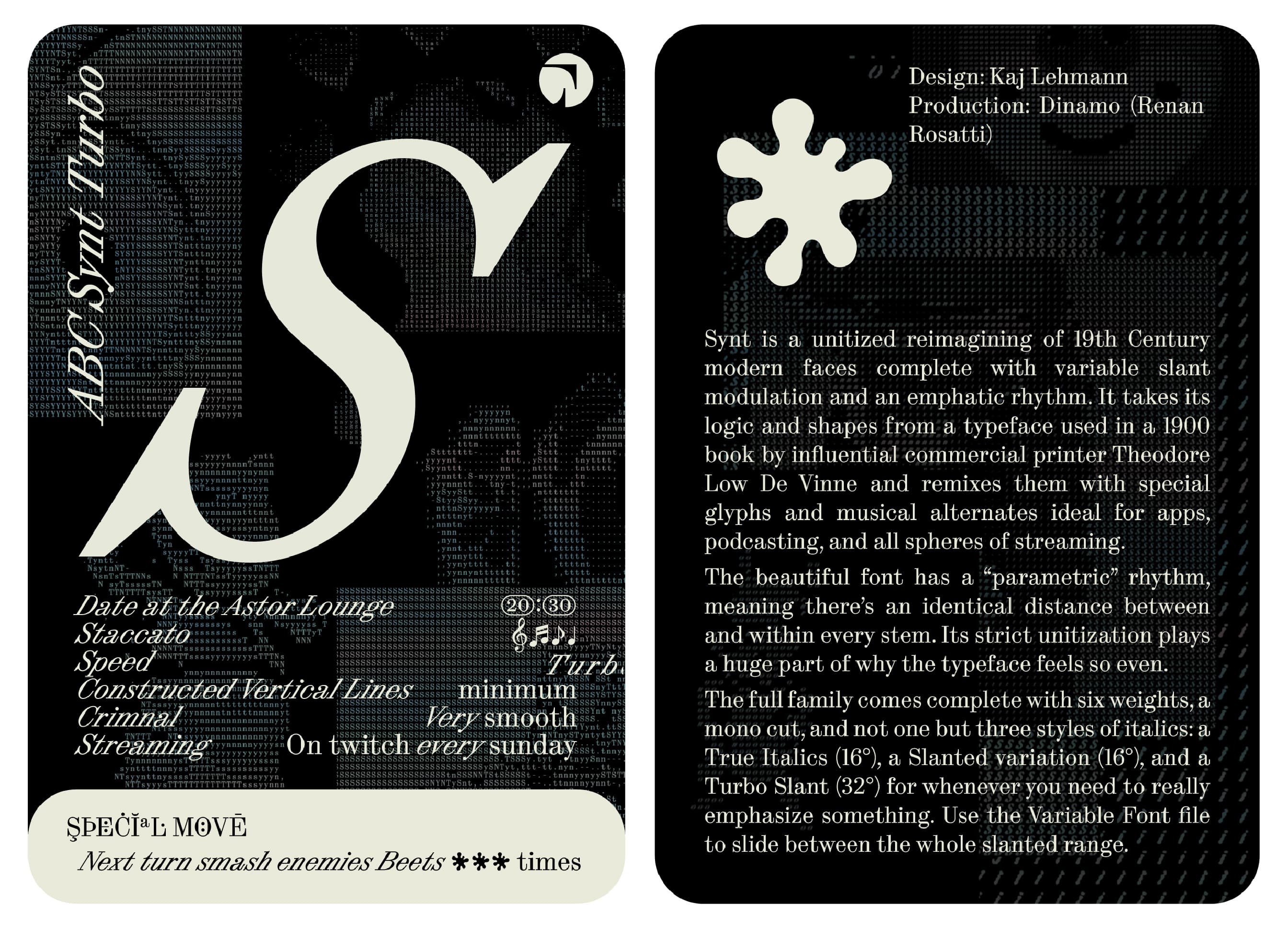 typefaces to gain a deeper understanding and appreciation of the work and
love that is poured into each typeface and character. Furthermore, due to this
medium's size, it offers a fairly inexpensive way to show potential Dinamo
customers the font in action on print. Like a mini
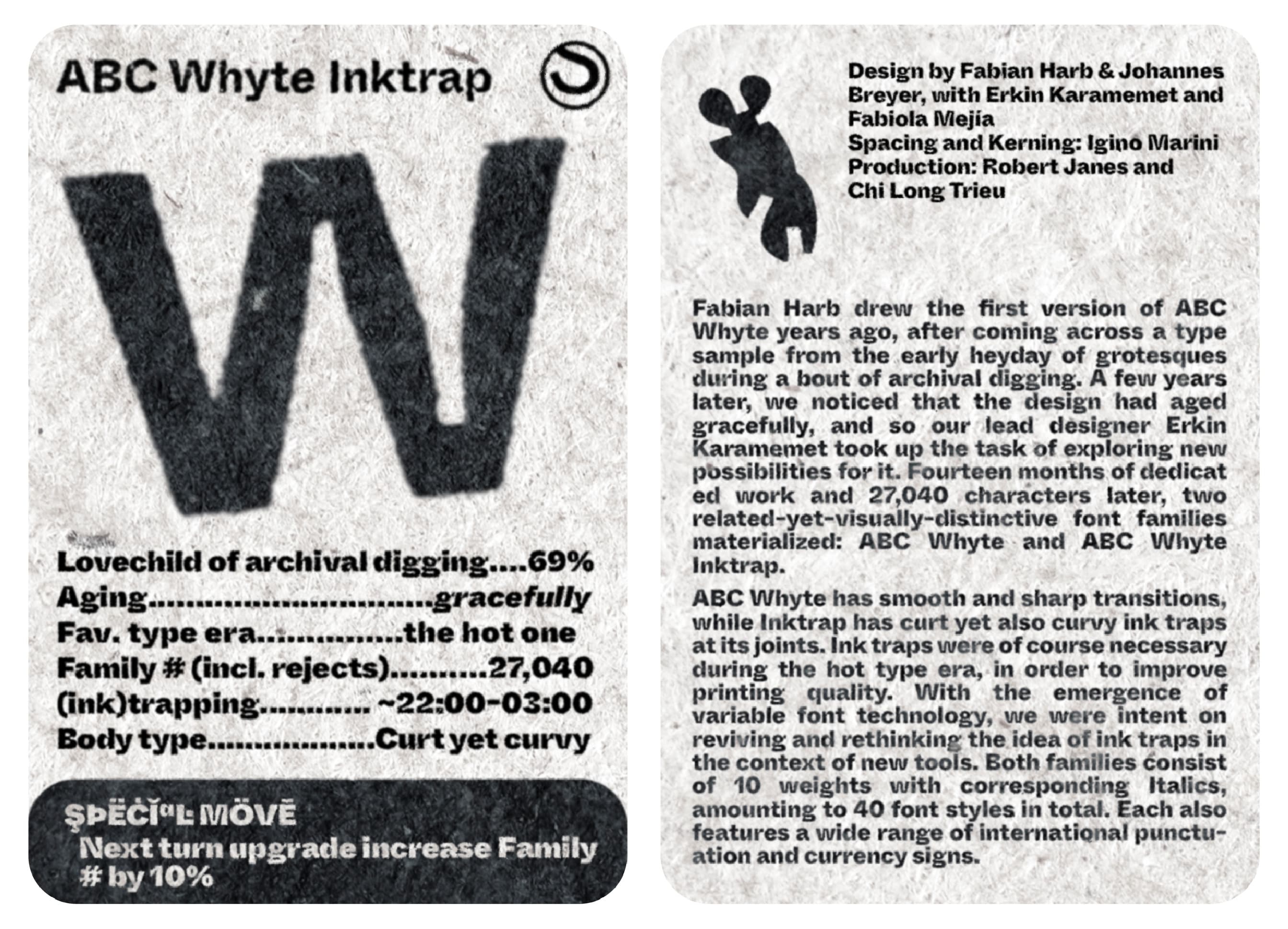 type specimen book :) A Dinamo Specimen Card! Perhaps that is a better name?
 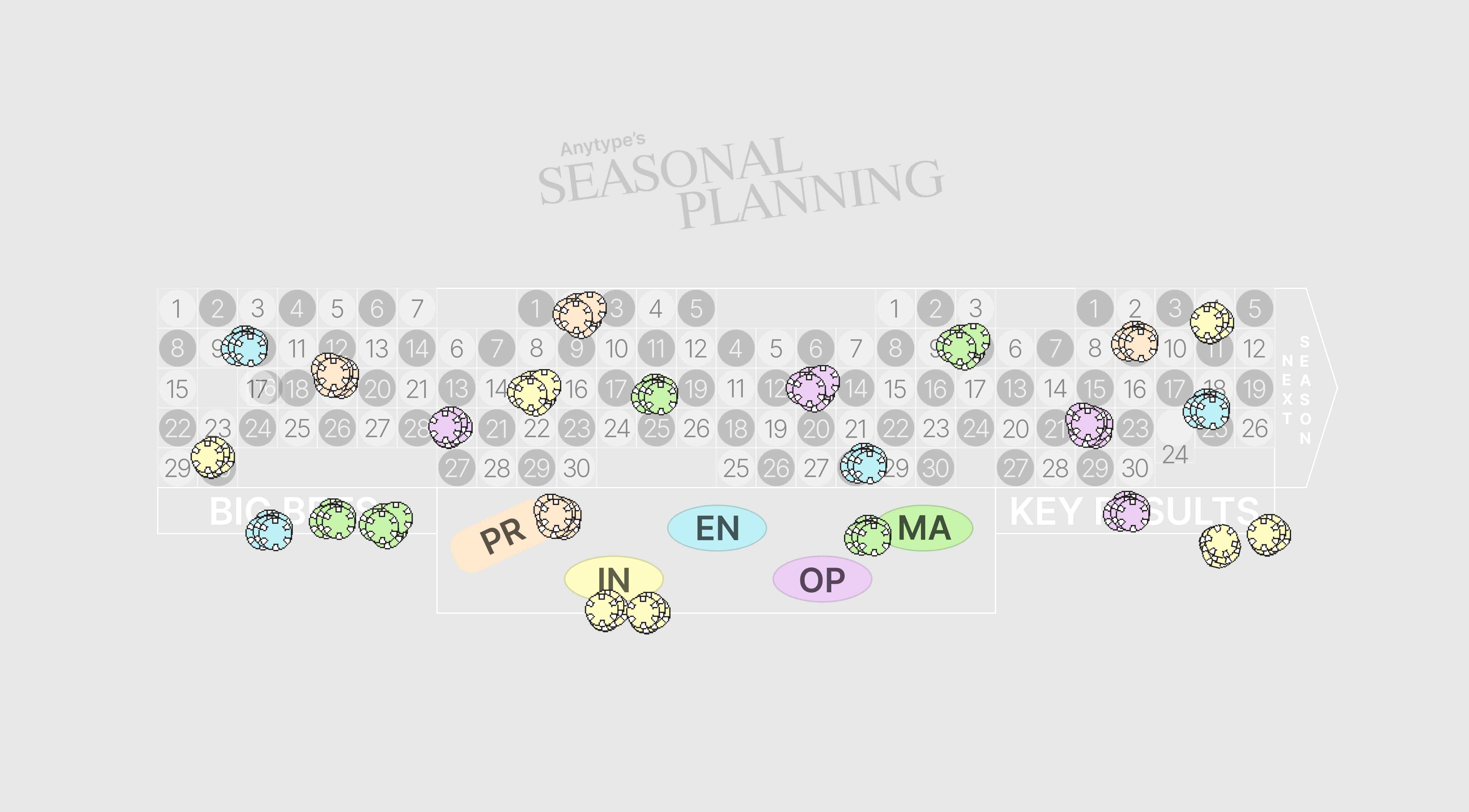 & Key Results", which discusses Anytype's way of working and planning of
goals over months and
 years.
 on the task and quite liked the outcomes.
 future last mile delivery
 drones will navigate and see our world, whilst assessing the
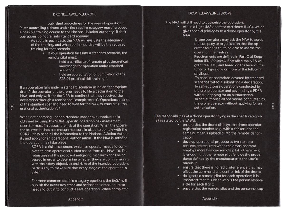 major hurdles that current
 generation delivery drones must overcome to be realistic
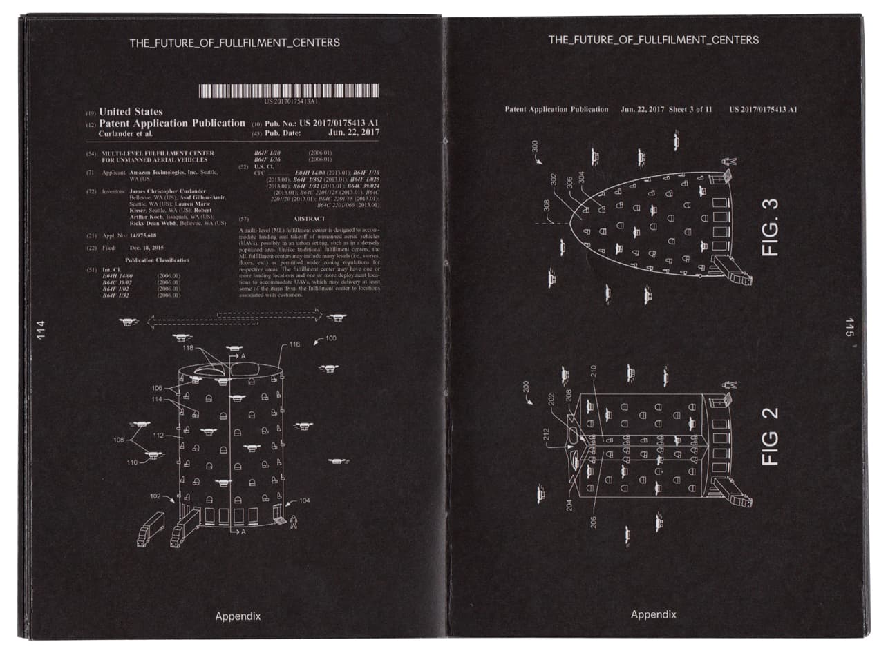 delivery vehicles.
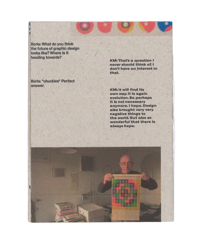
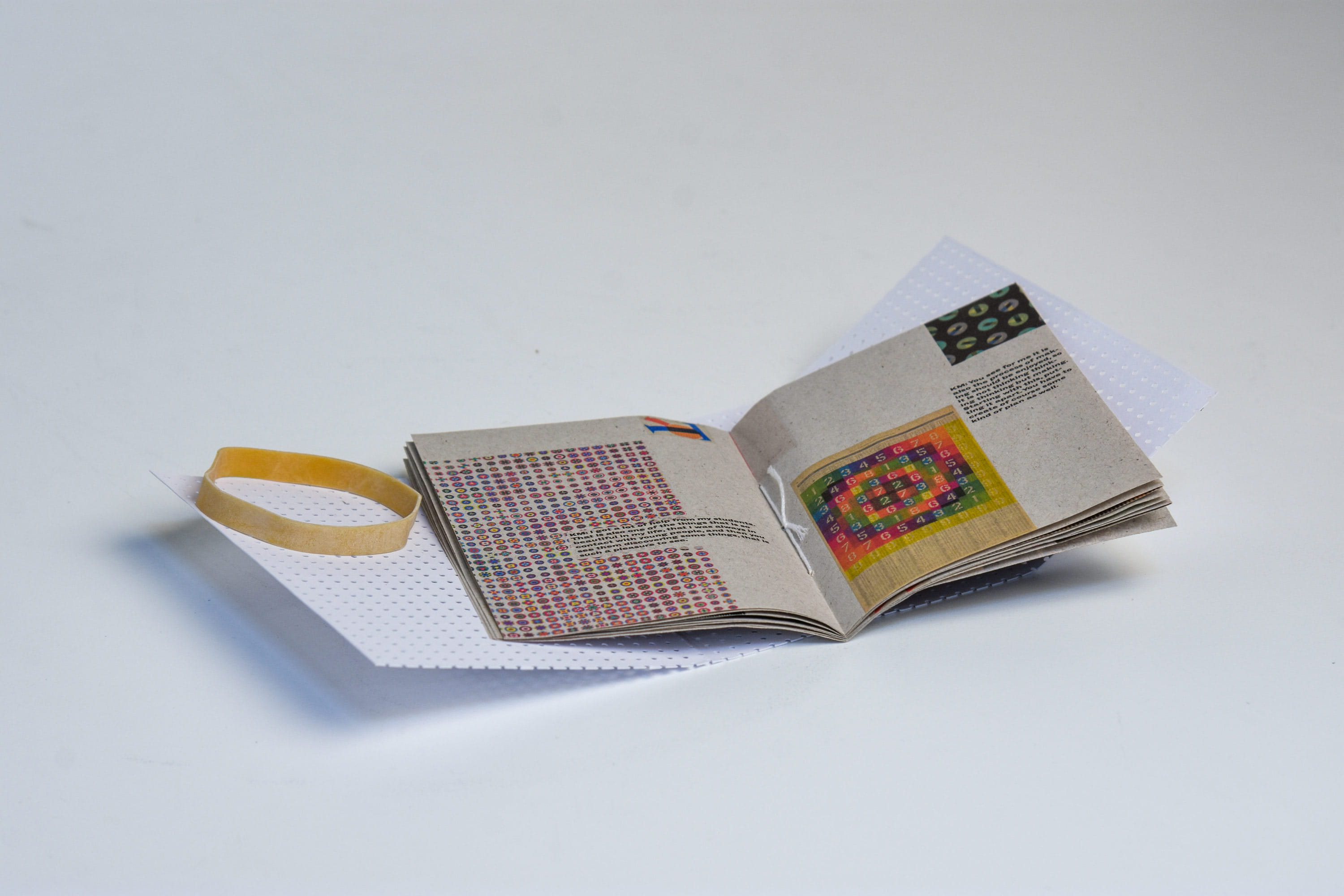 with excerpts from interview with Karel Martens about his design practice
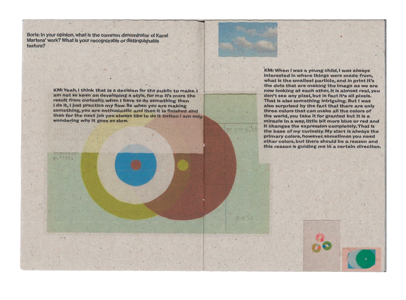 , design systems
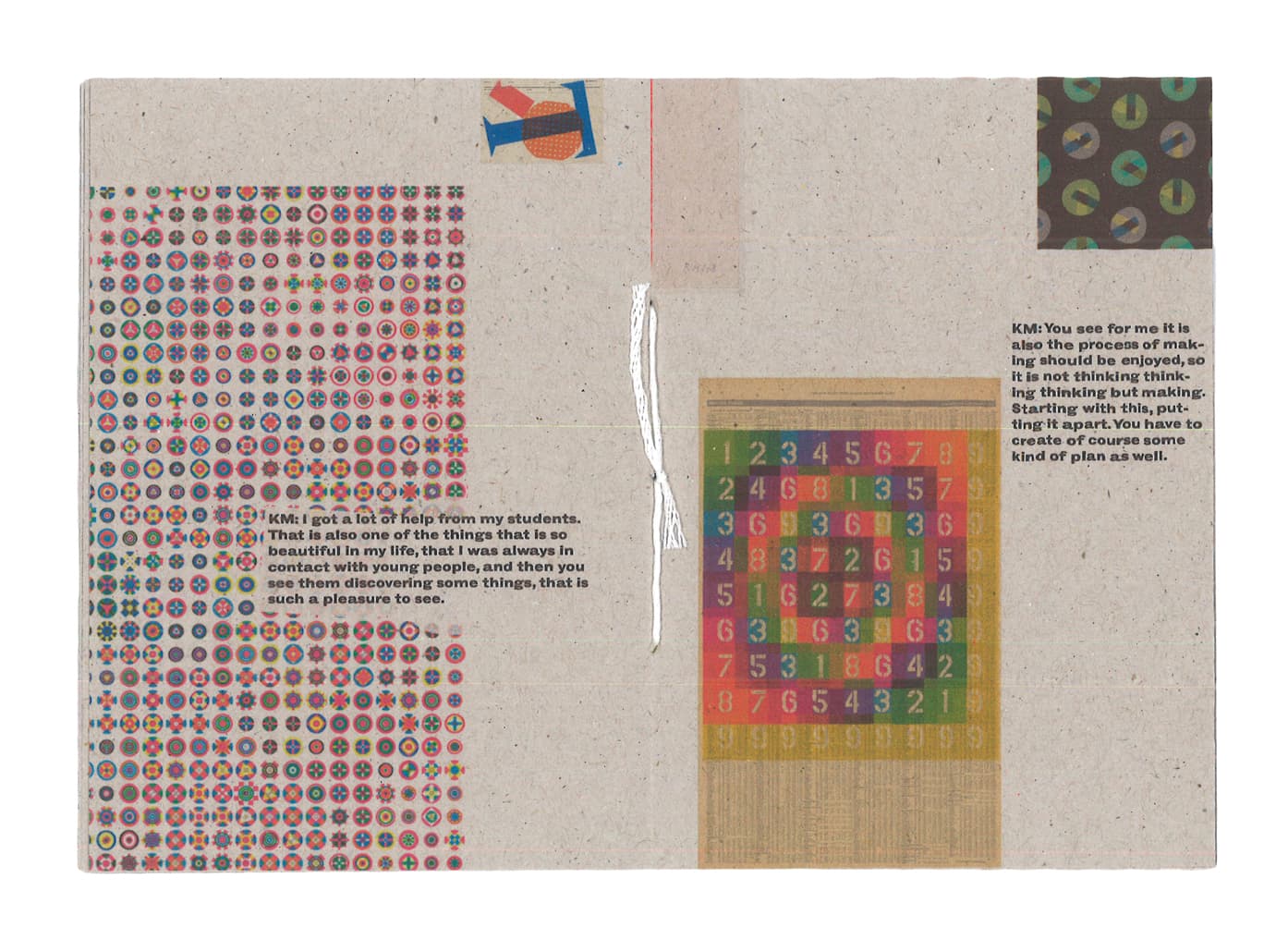 , and his love
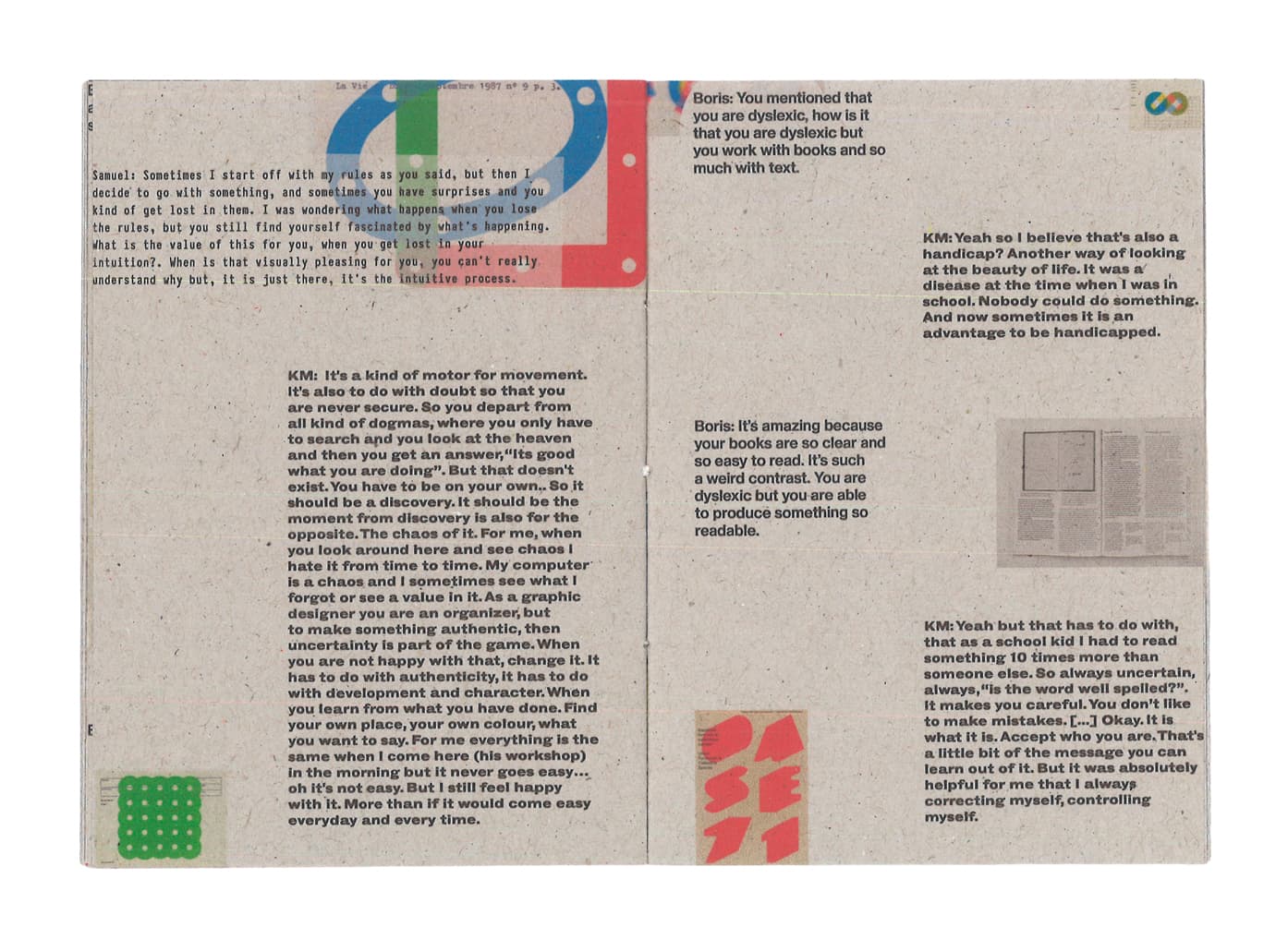 for teaching and virtual
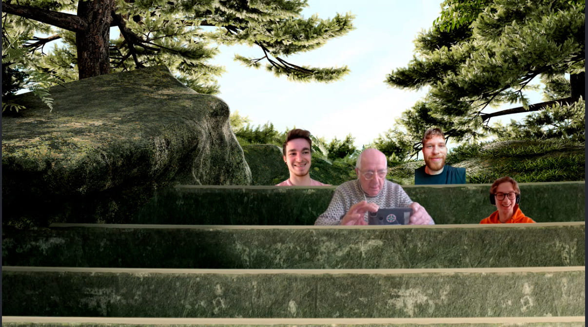 forests in skype
 .
.
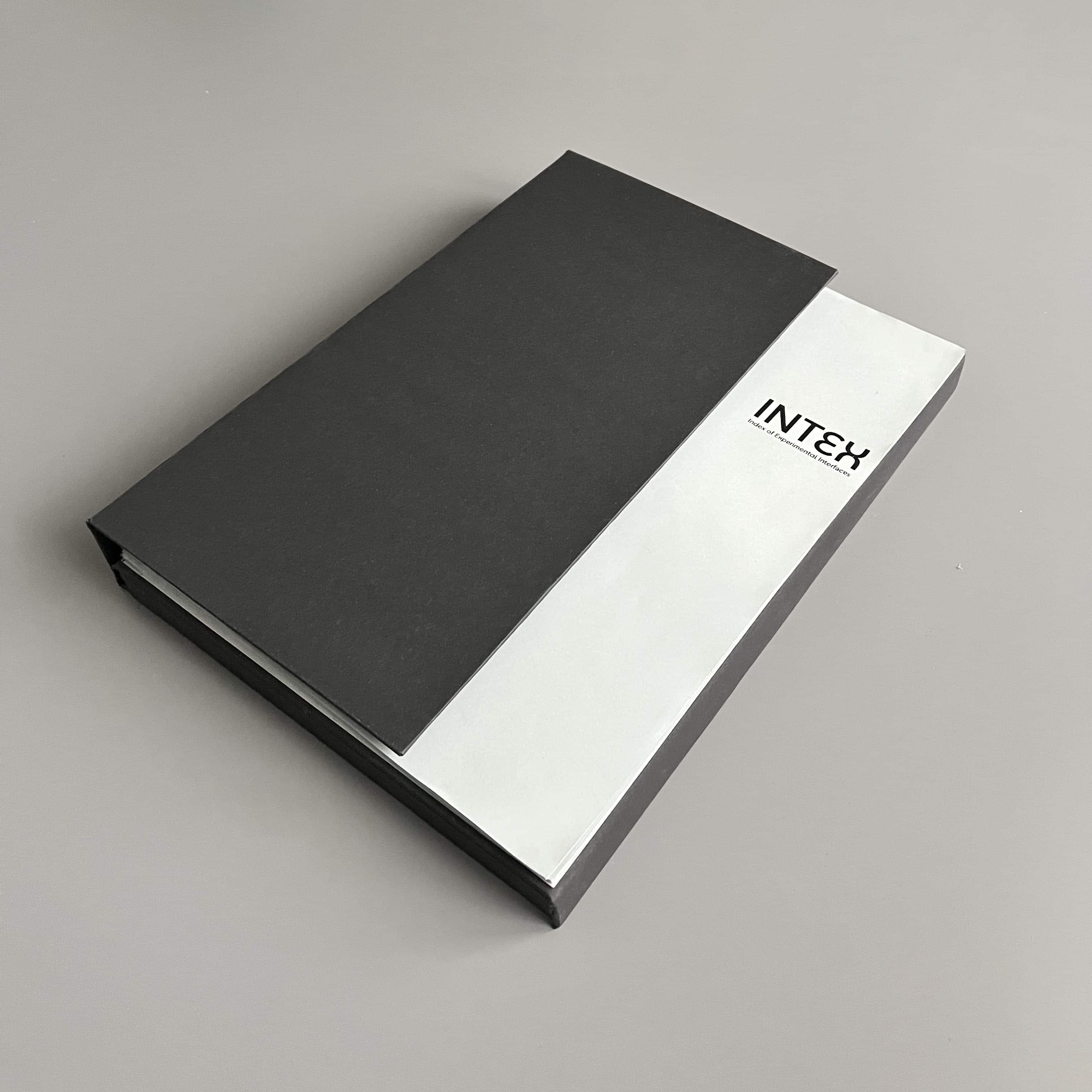 images look like?
 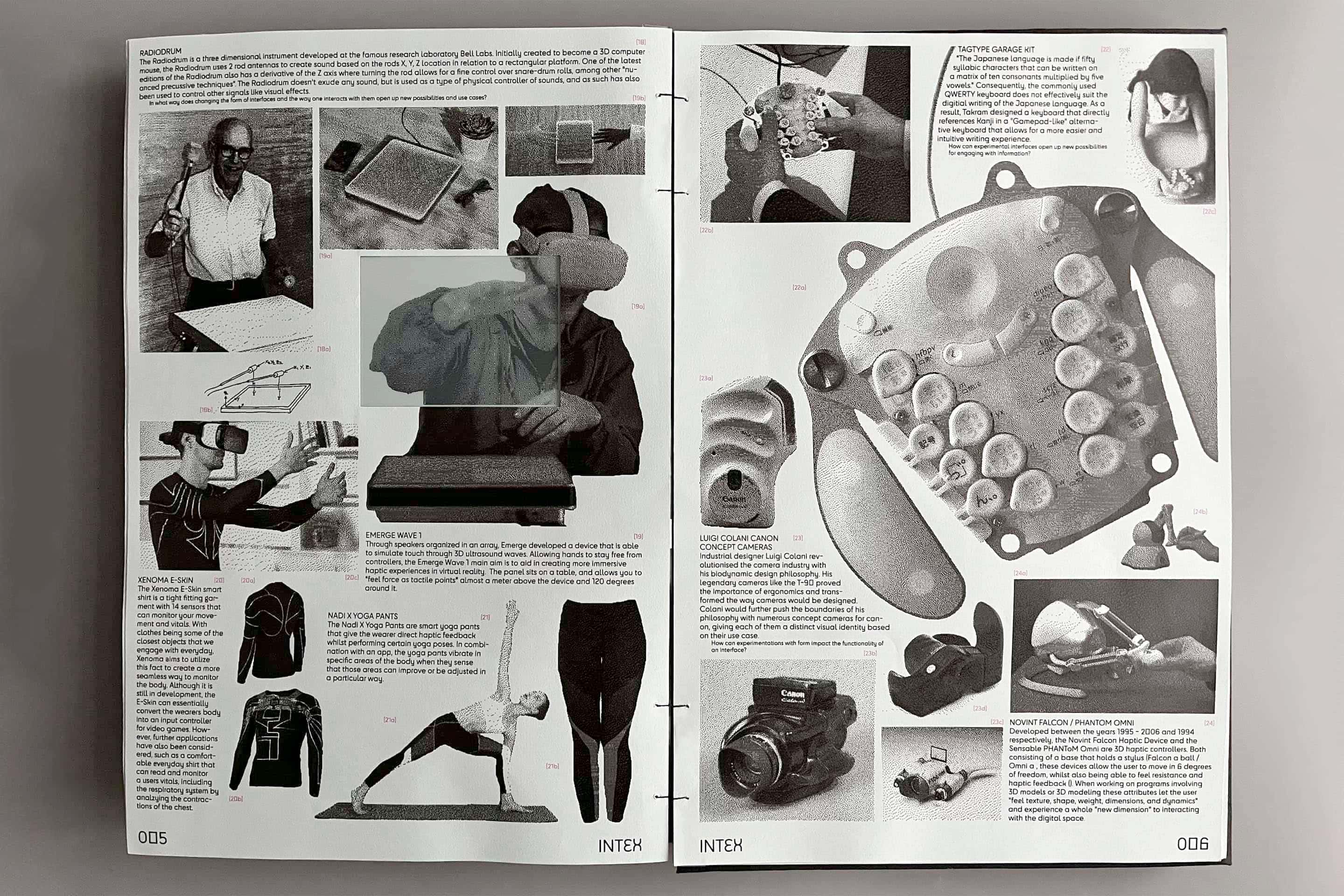 narratives, gain knowledge, question ideas and ponder on the similarly infinite possibile
ways in which information can be presented, processed,
and created by interfaces. An experimental interface itself, Intex shows the power of variable
curation and association
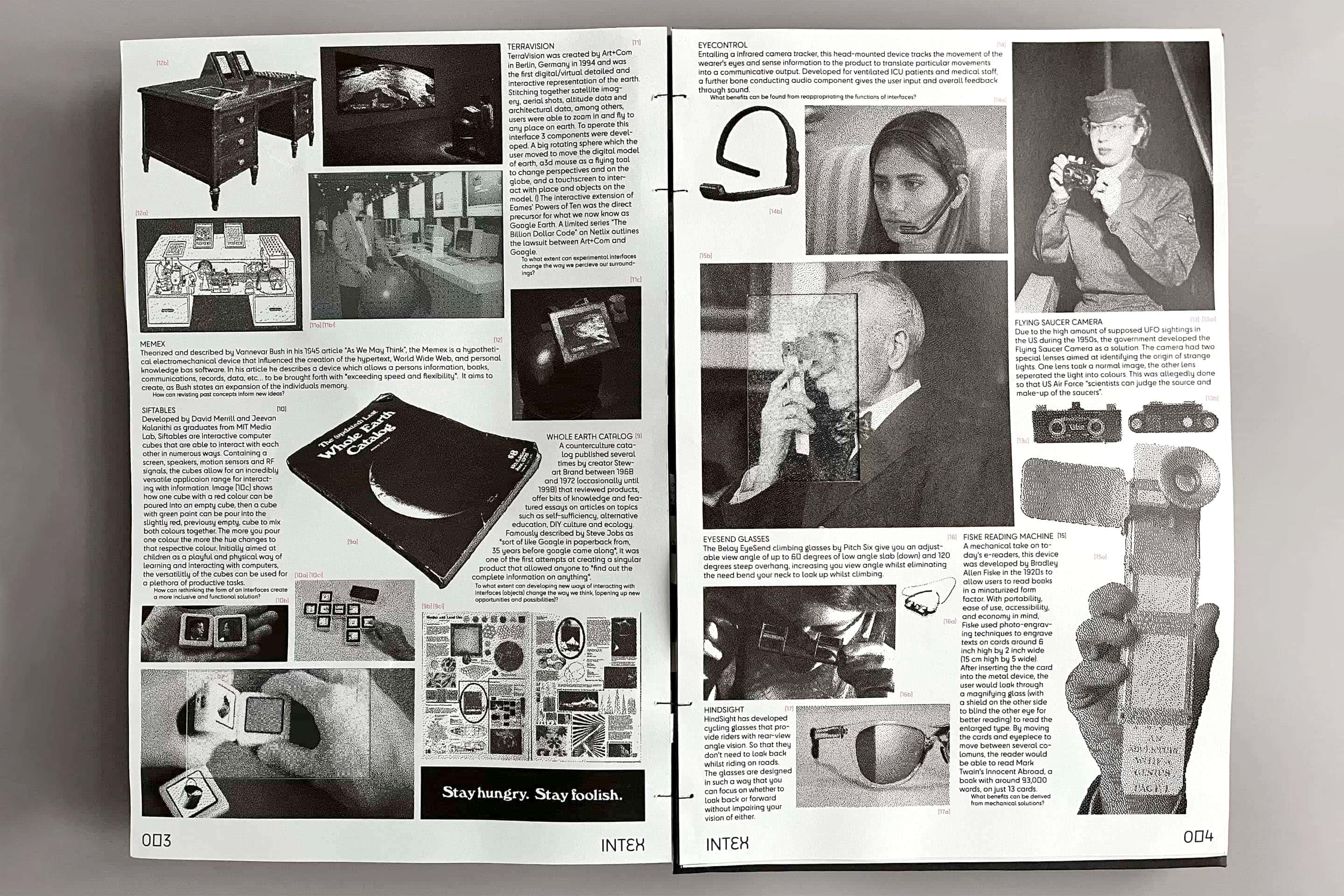 , and is to be used as an endless index for the creation of potentially impactful ideas.
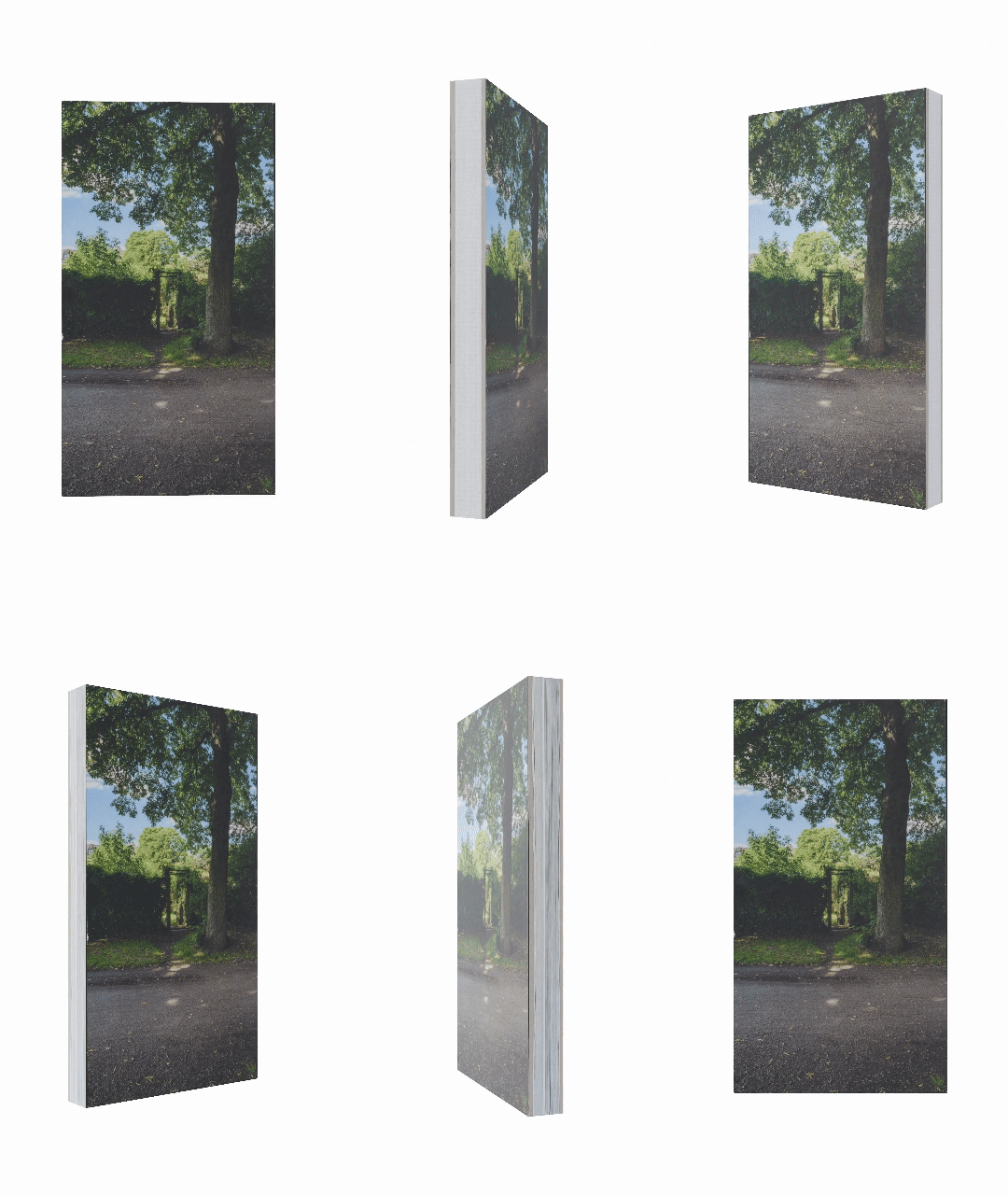 design in collaboration with Claudia de la Torre's Backbonebooks
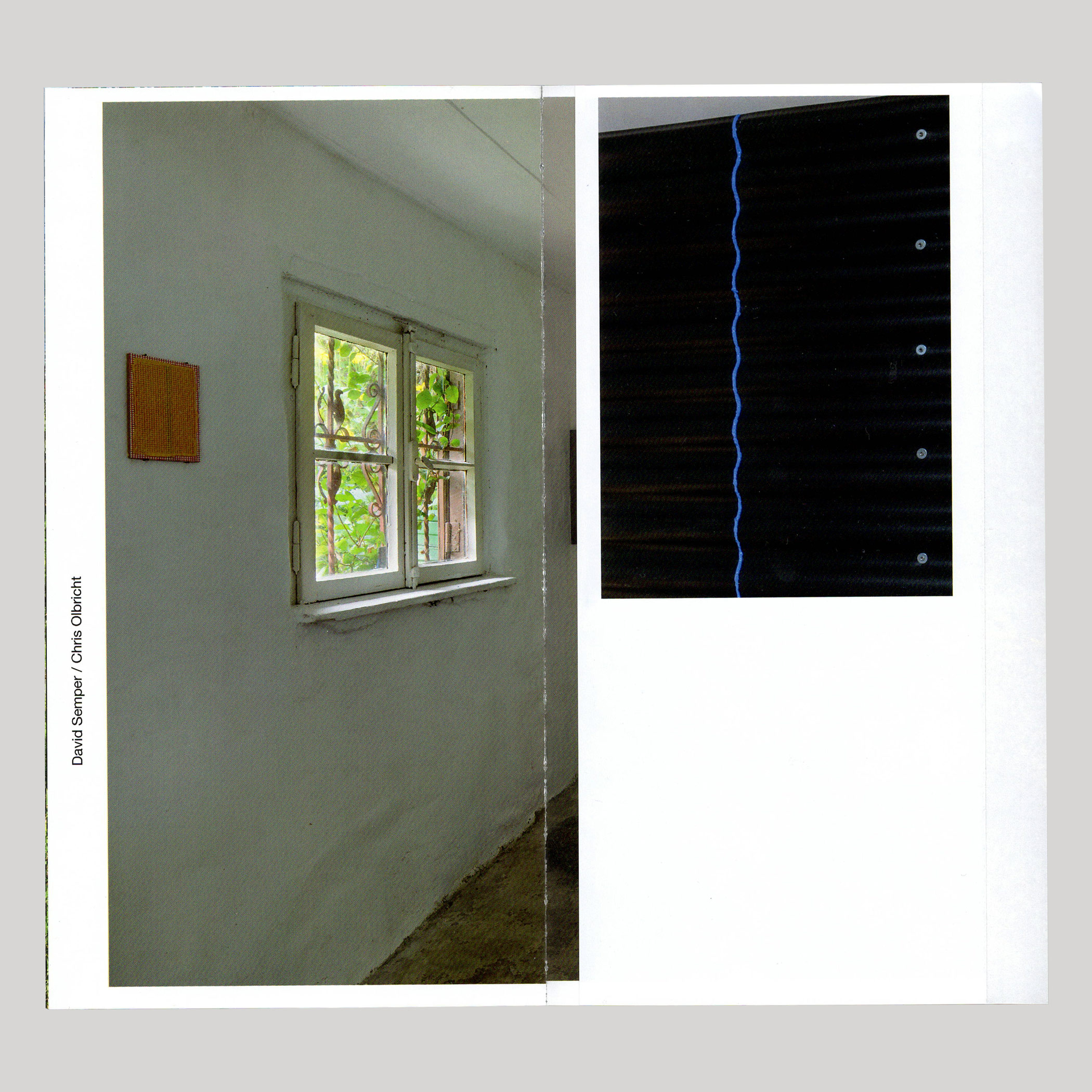 for Kunstraum K634. This book shows exhibitions that took place at the
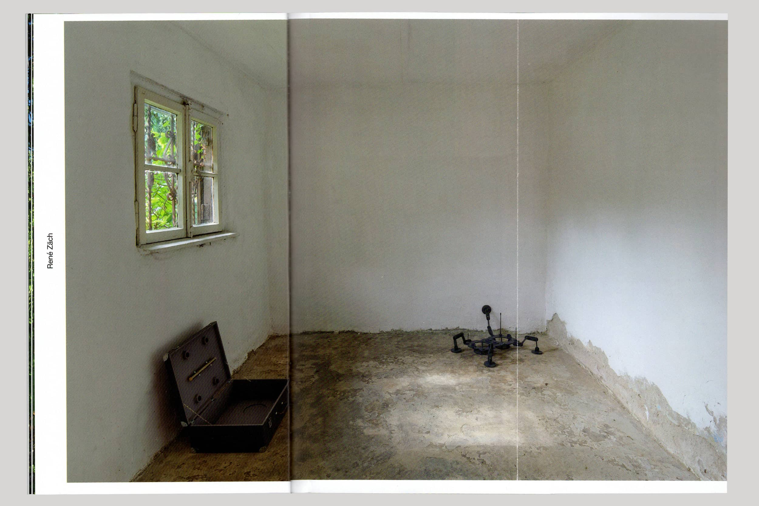 Kunstraum K634 in Köln,
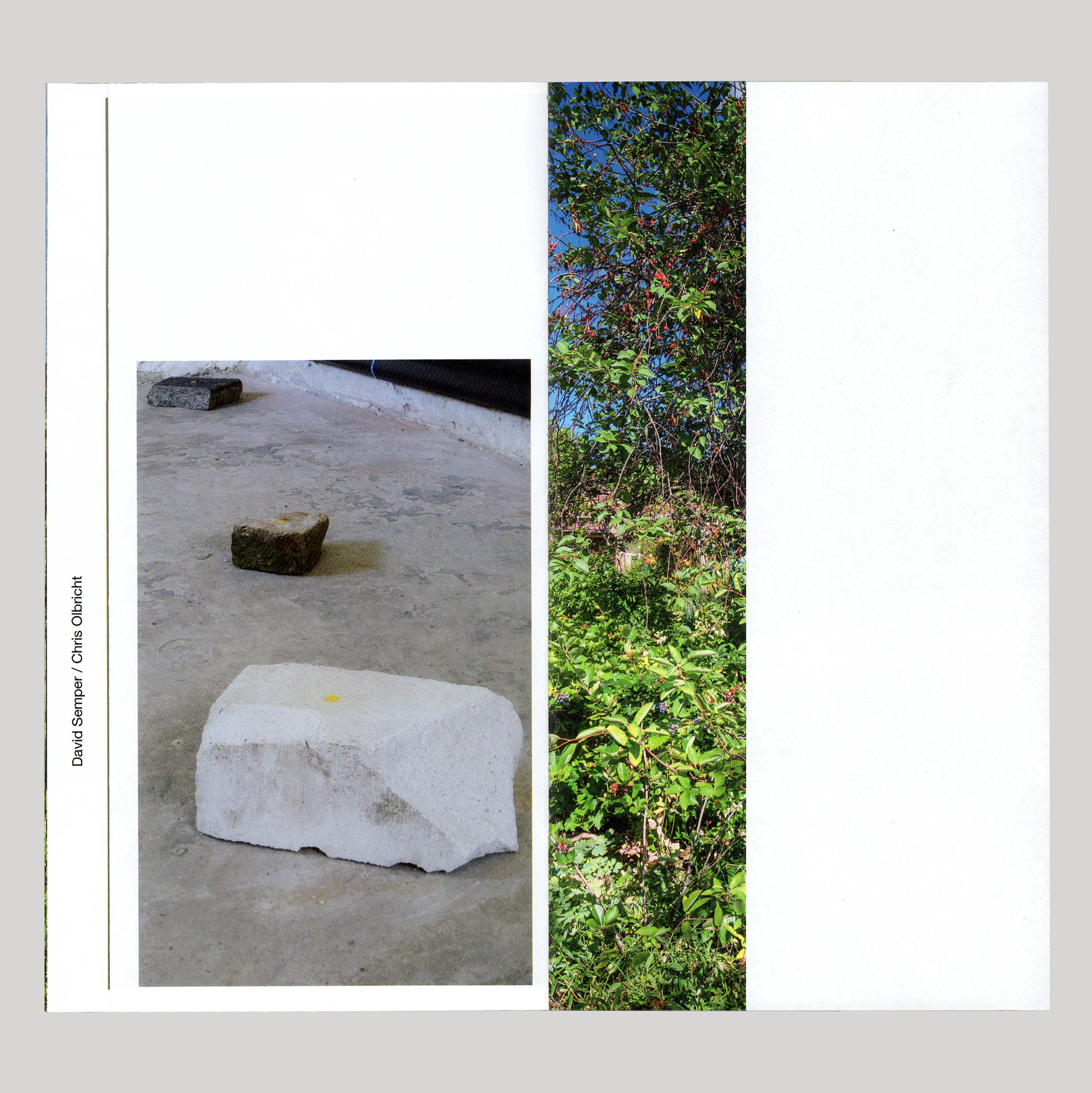 whilst progressively taking readers through the garden
 that precedes the space.
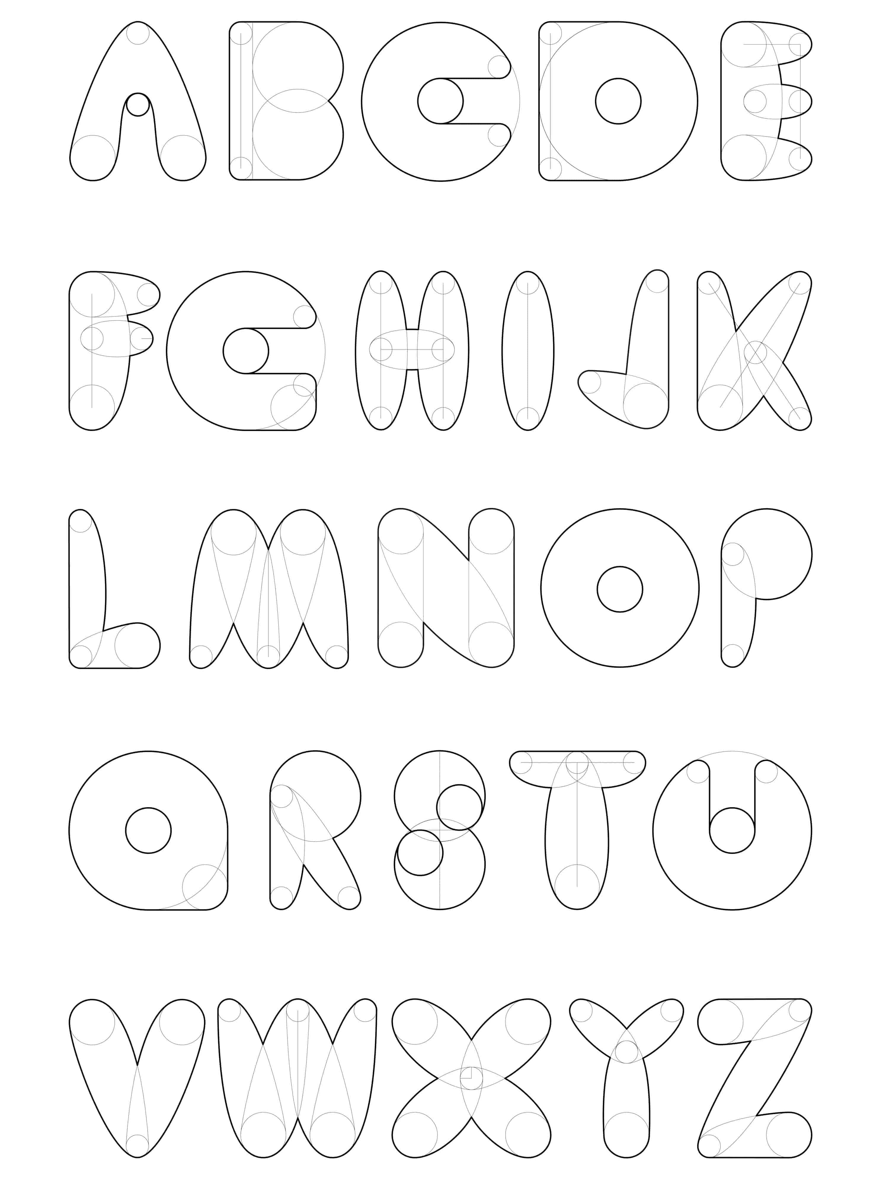 construction. The structure is based on 4 mathematically related
 circles (8mm ø , 16mm ø , 32mm ø, 56mm ø ) and an orbital
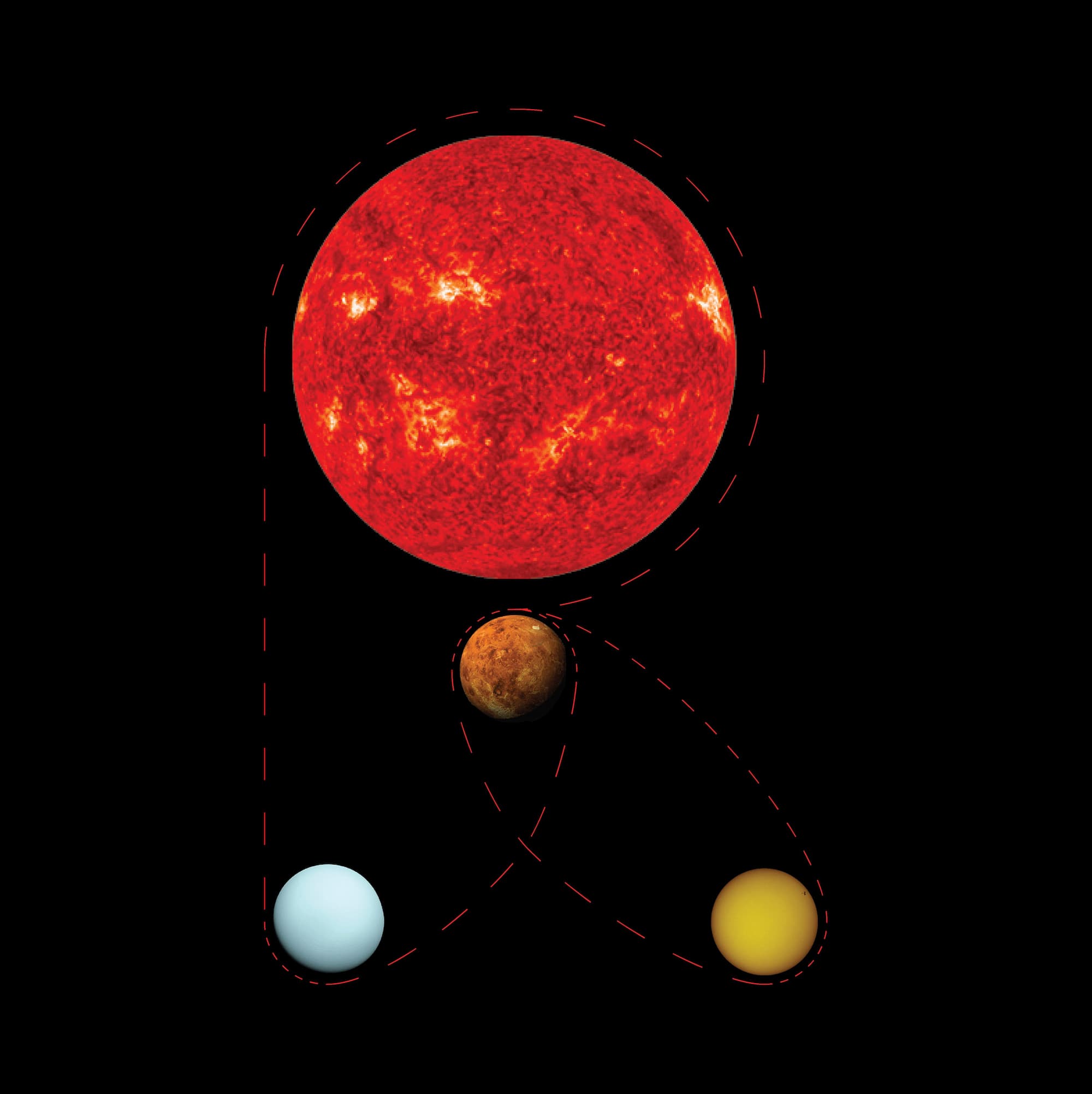 (or rubber string) like connection between them.
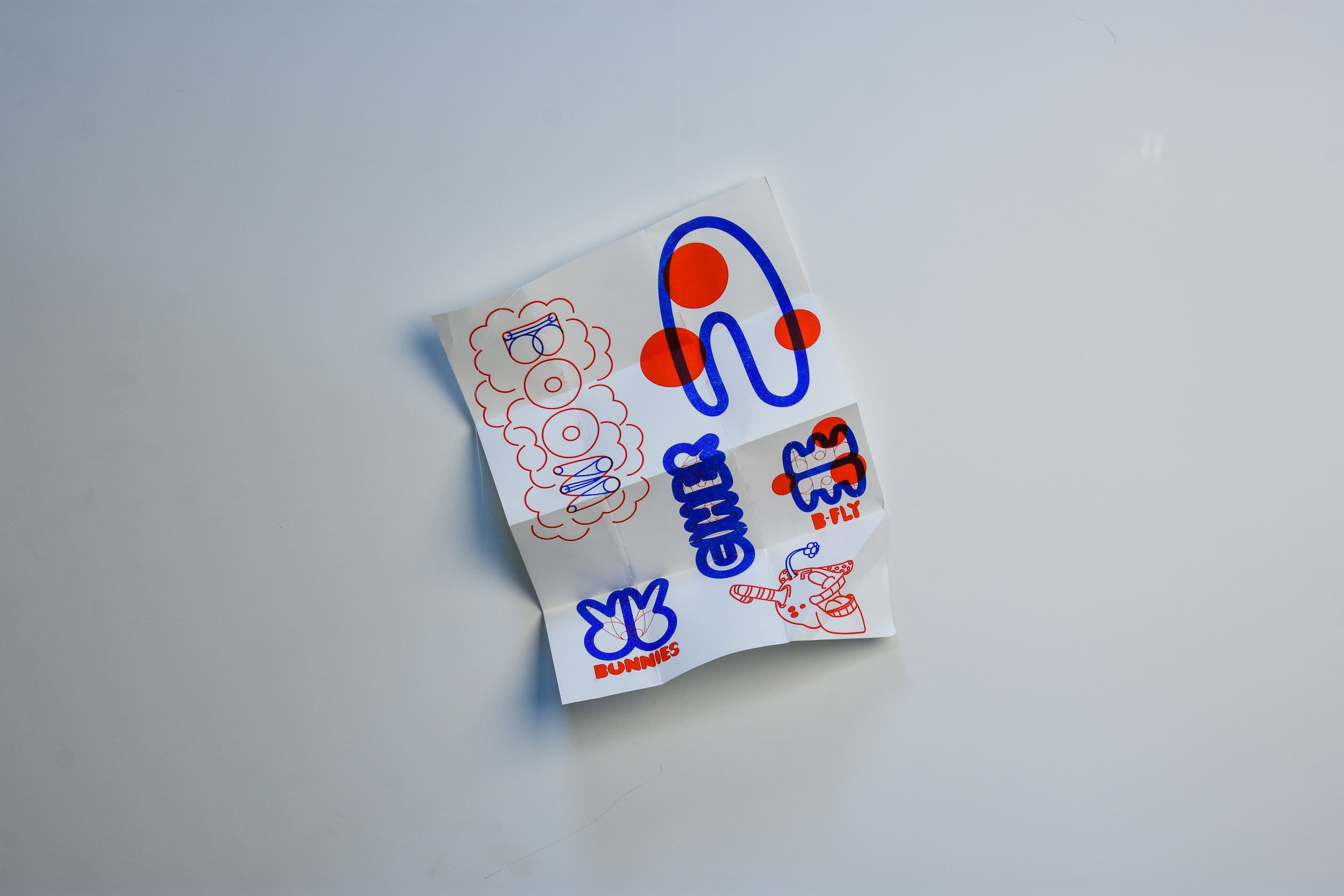
 of the font/ character tackles an idea I had about designing a typeface to be used both digitally,
 but also to be drawn
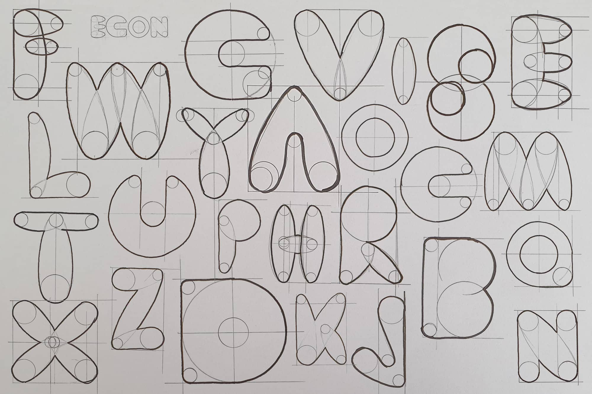 by hand. Simplifying the characters and allowing the user to see the structure underneath
gives them the ability to draw and see
 the typeface in real life quicker.
  , play, and experiment with it. As a result, the font can be used to
 target many moods, niches, or
 implementations.
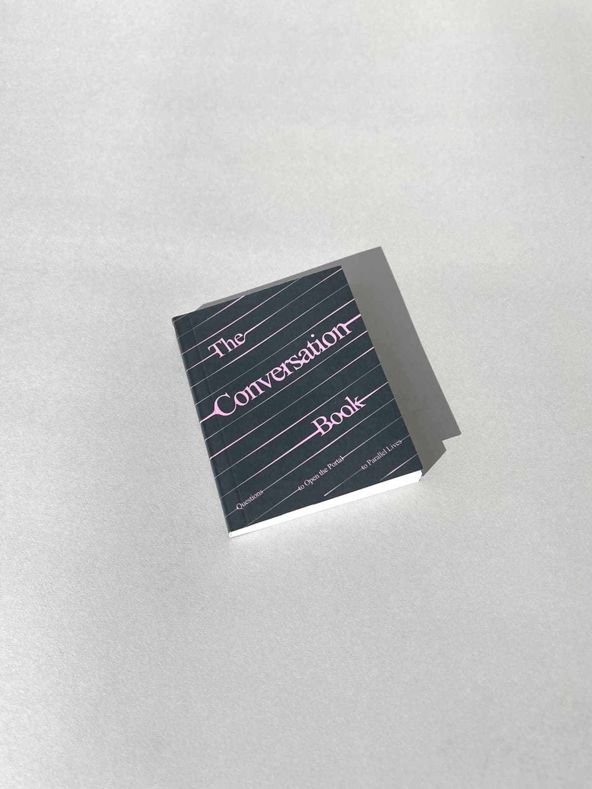 and content for Circadian Books second print run of
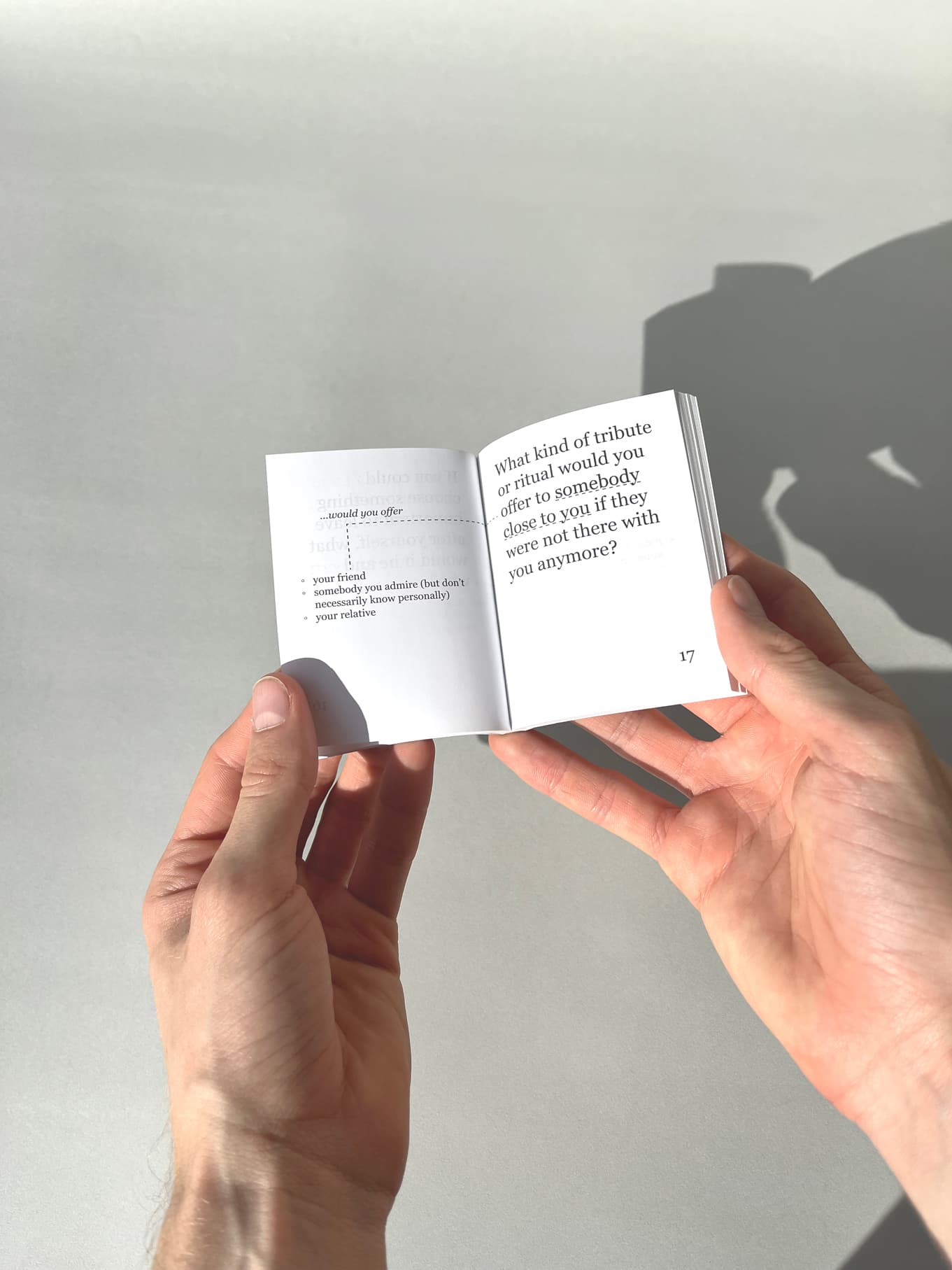 The Conversation Book. "Questions to open the portal
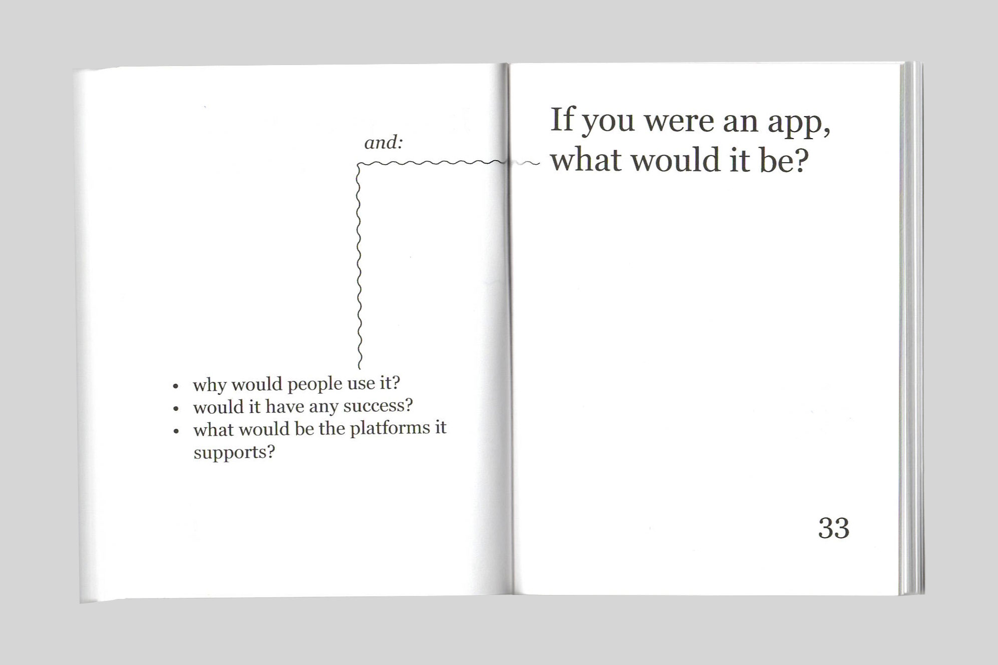 into parallel lives. This book is com-prised of the hypothetical questions
that pro-pose to imagine alternate
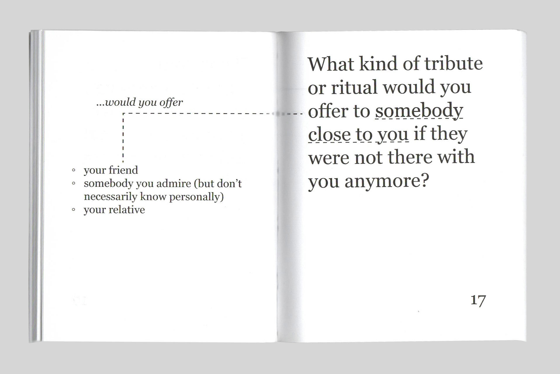 realities. Best practiced with a partner, every question can be used as a
conversation starter to explore a
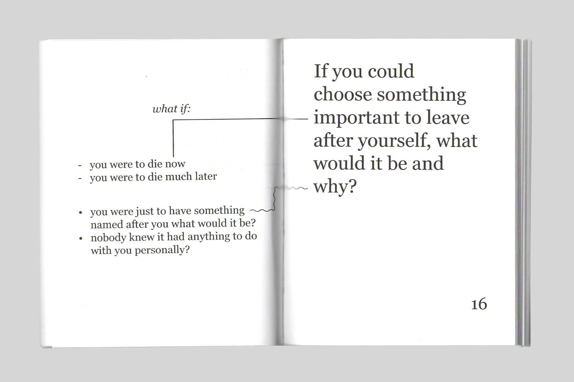 different version of yourself and of each other."
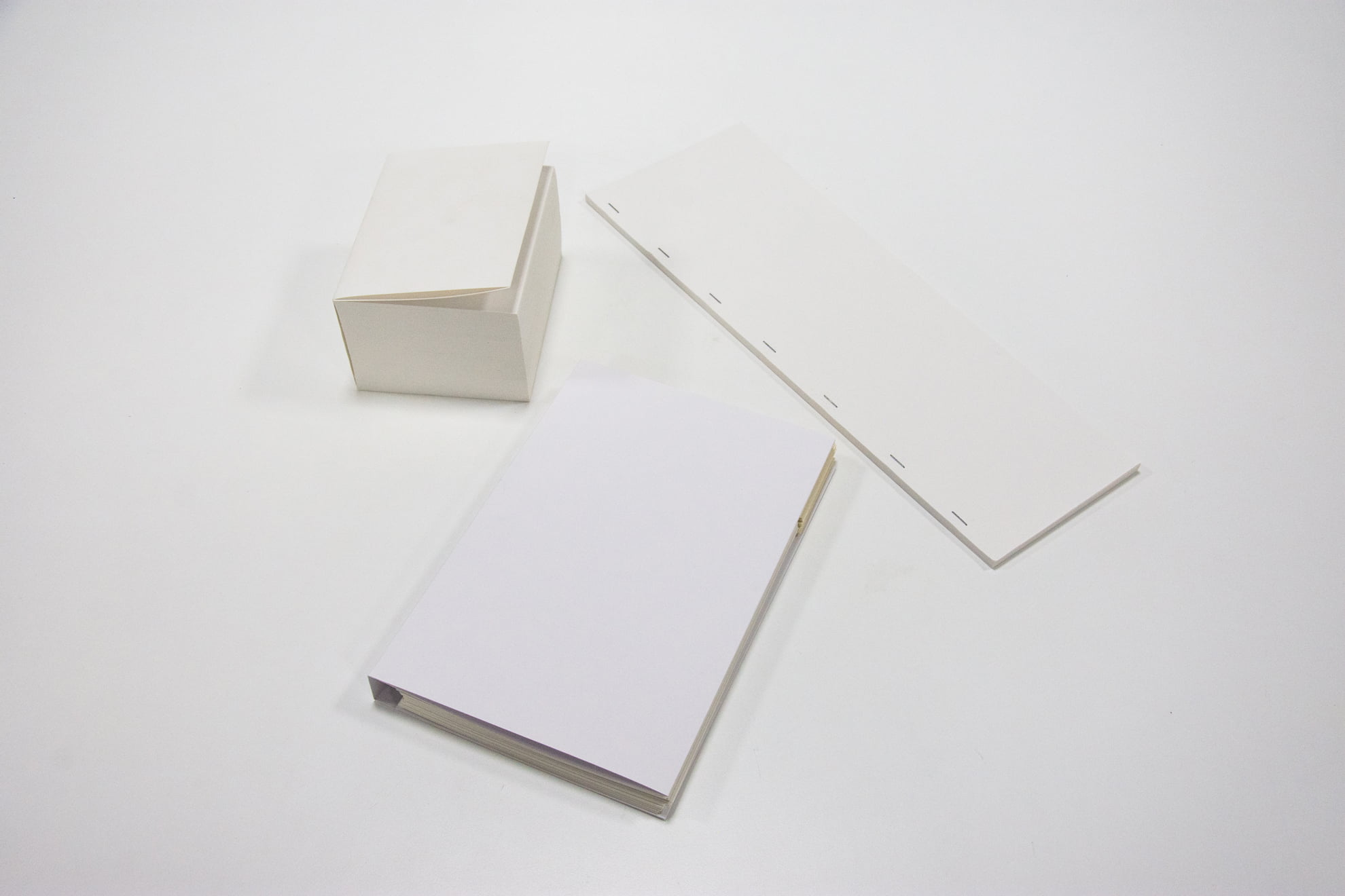 exploring the ways one can use the physicality of the book
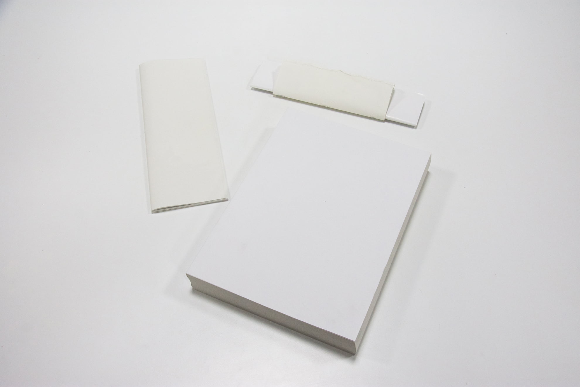 to communicate meaning.
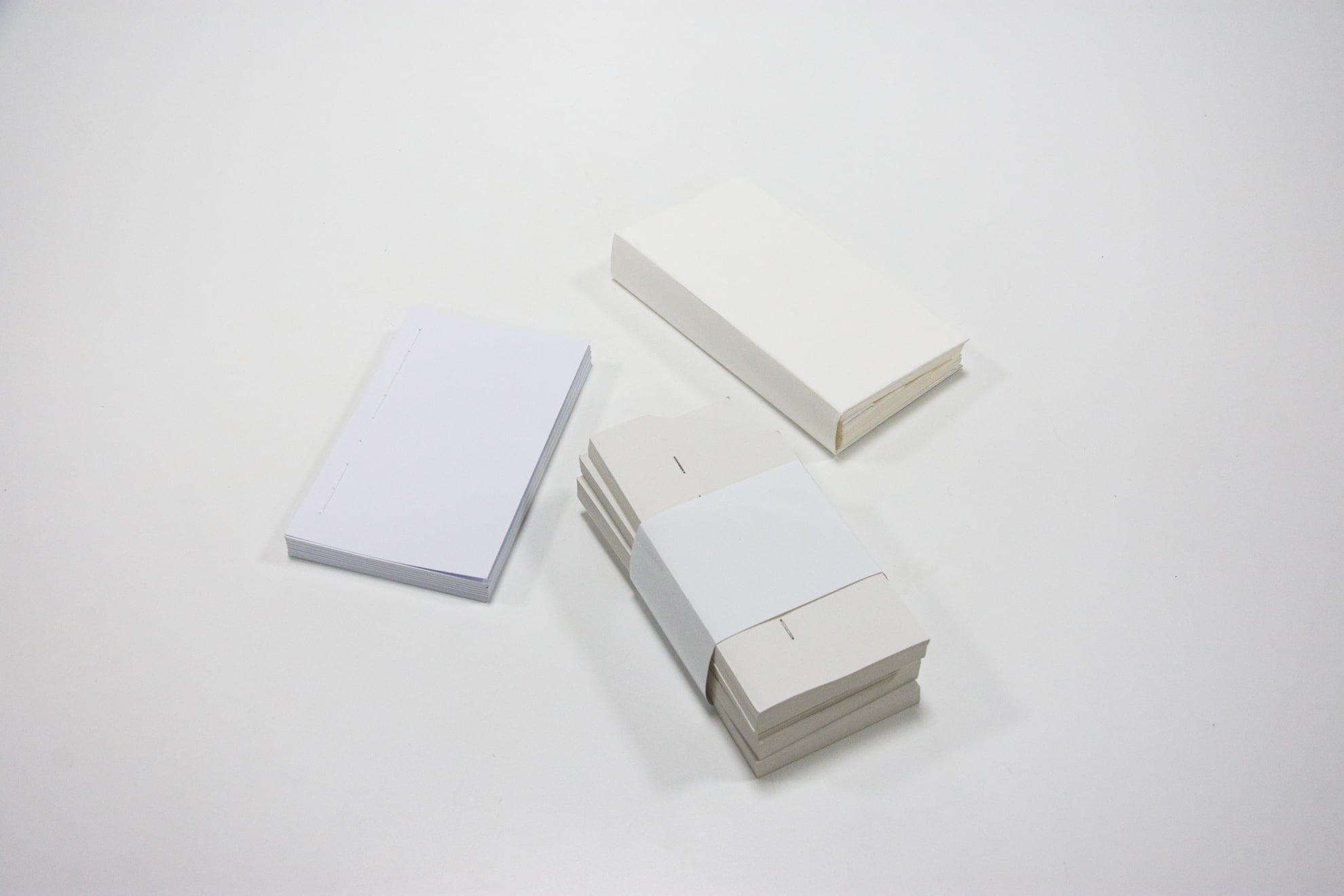 attention of users, the book needs to emphasise the unique ways with which it can convey meaning.
Unlike other information communicating devices, the book can transmit its content through its actual
physical form, delivering a
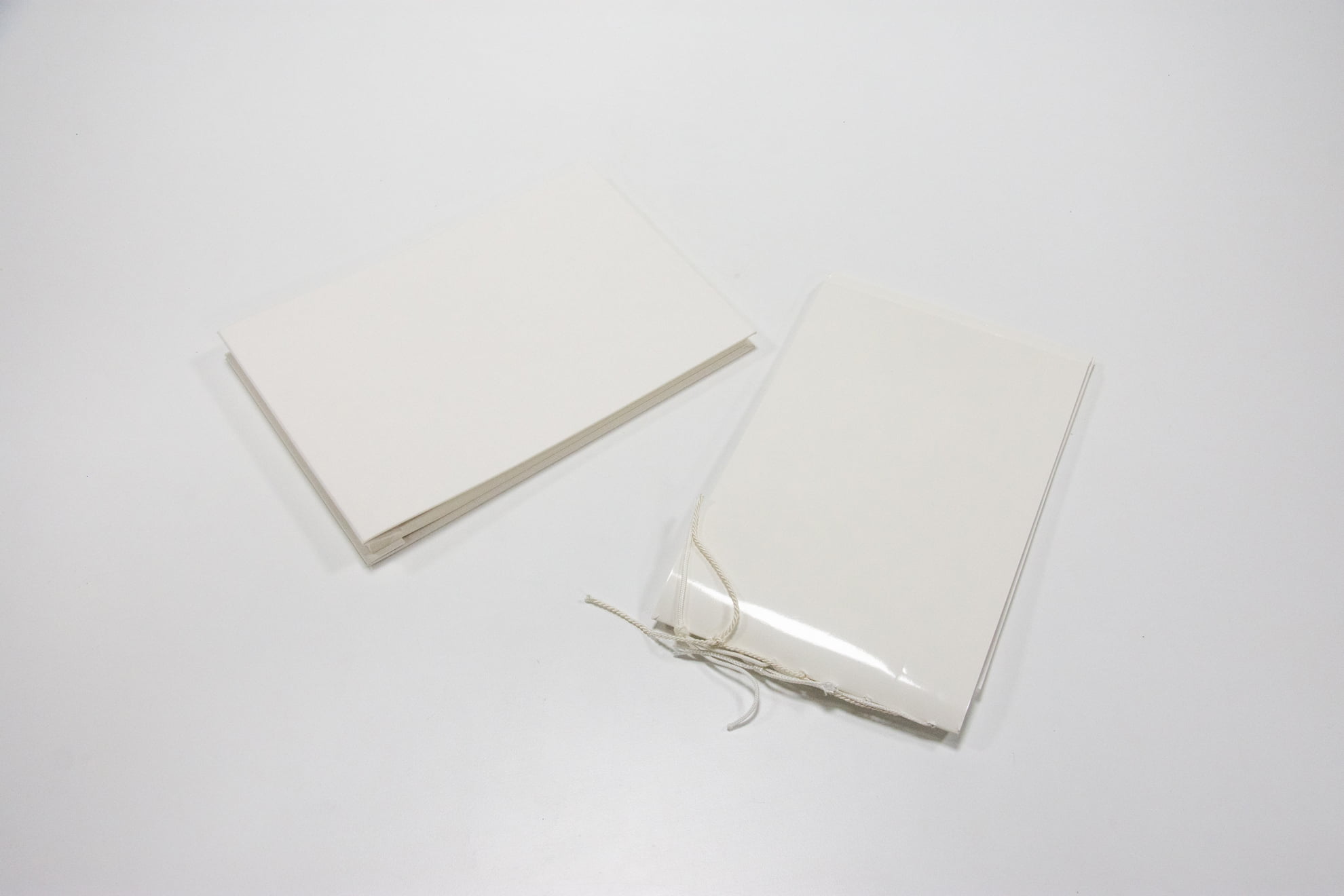 multidimensional content experience.
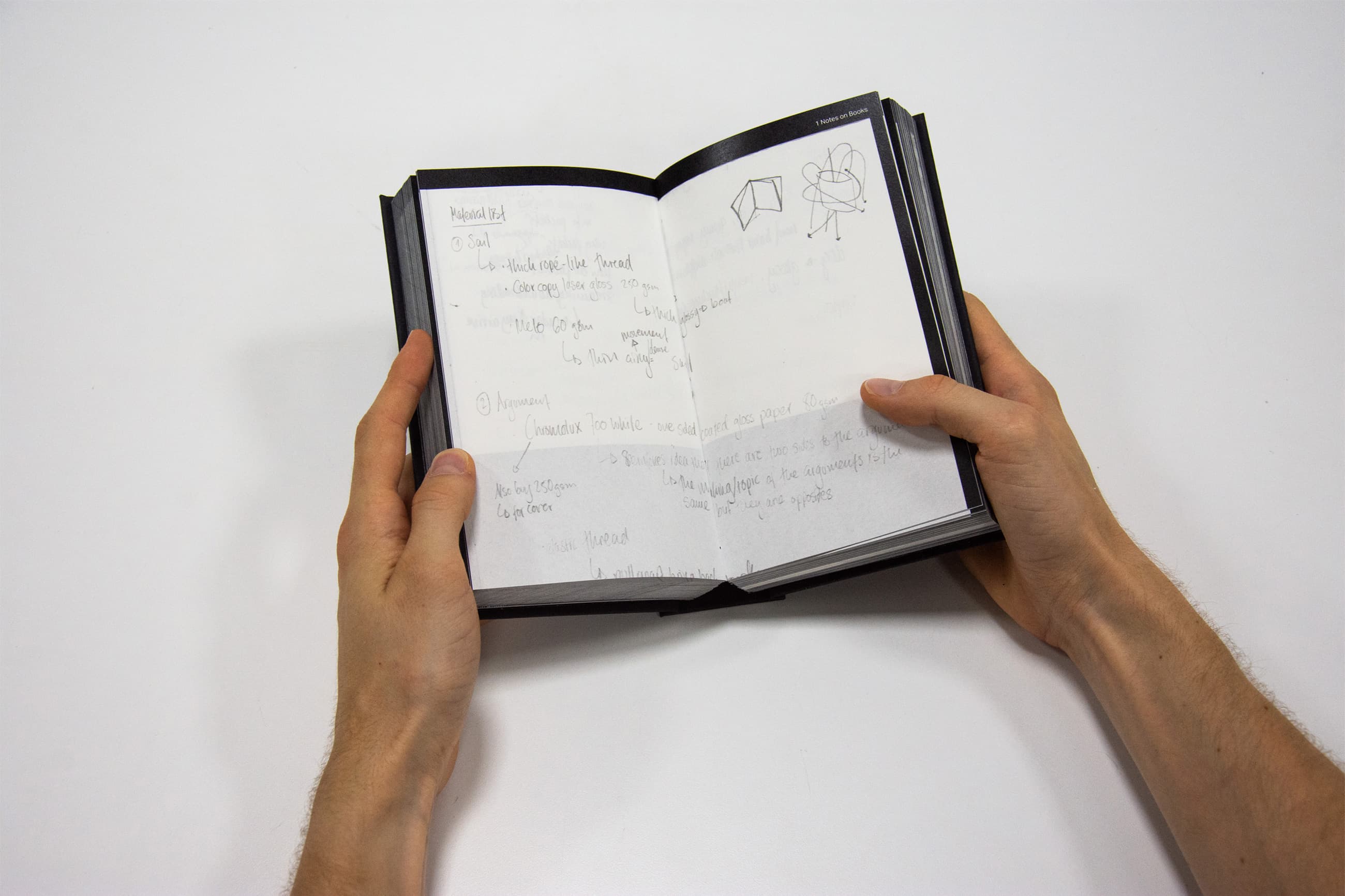
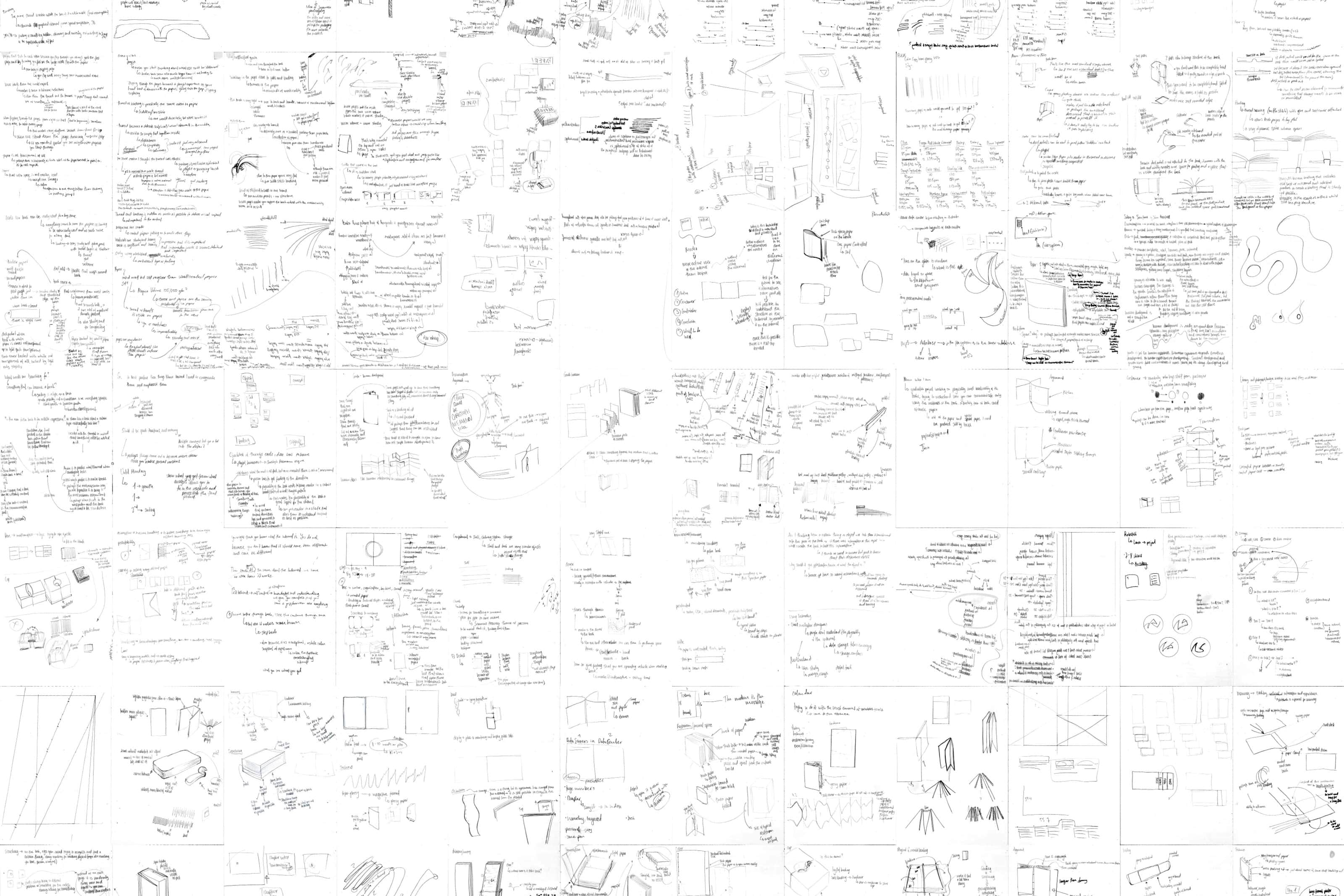 books designed by professionals I admire, to learn uncover
and understand how they used the materiality of the book to communicate meaning
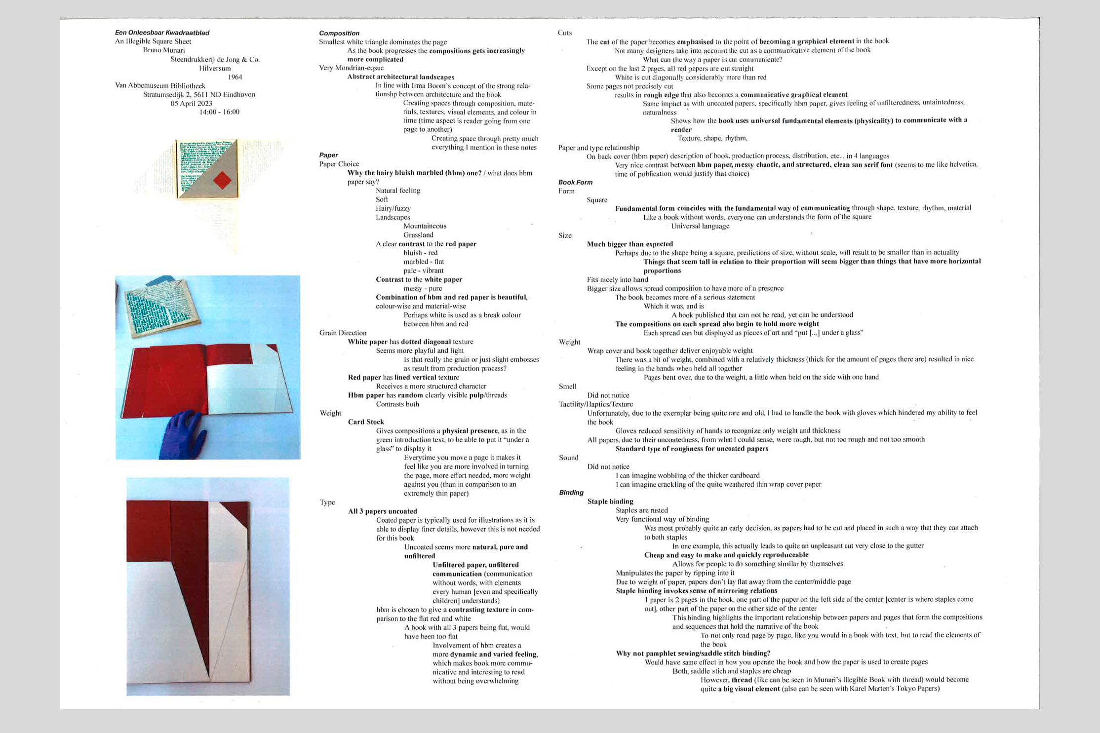 . Through several steps (3 steps), I revised my notes by formating them in different
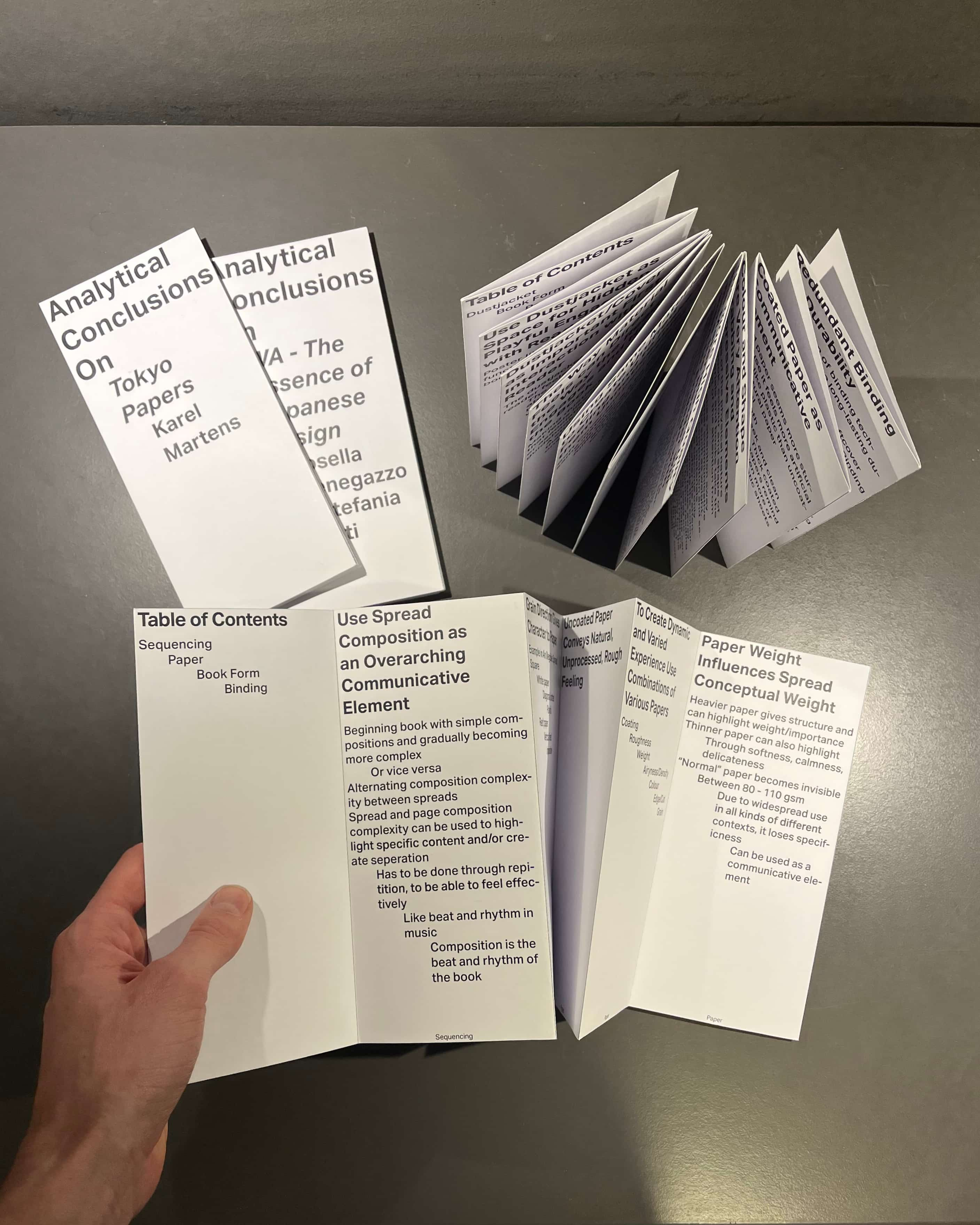 ways. This technique, learned at DAE, allowed me to uncover ideas and concepts that I hadn't
seen or noticed before.
 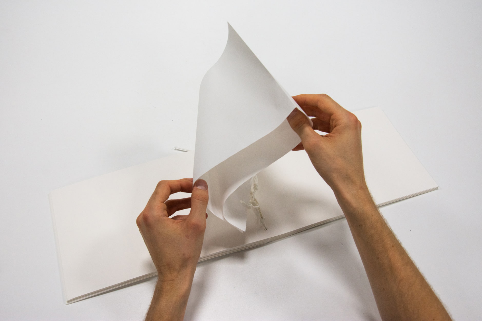 collaboration with
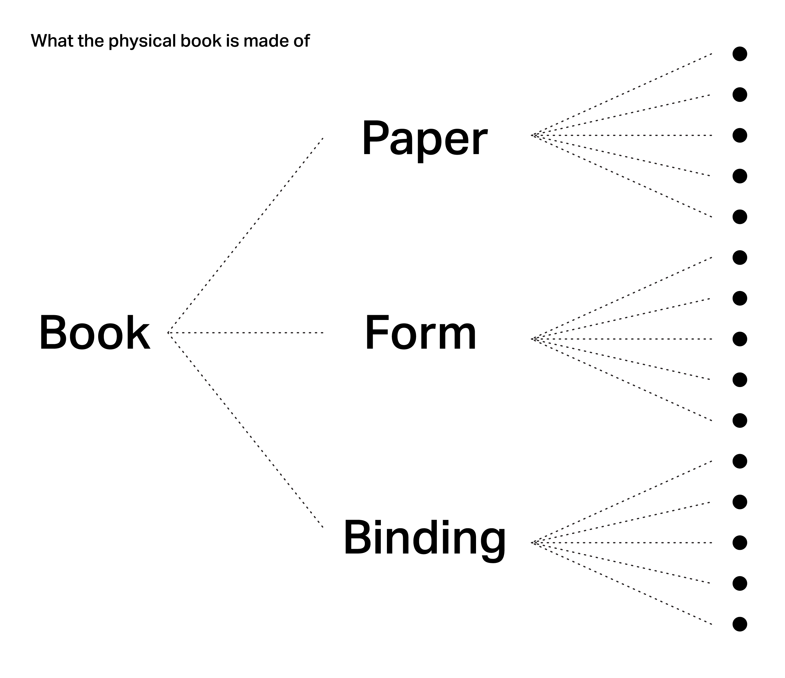
 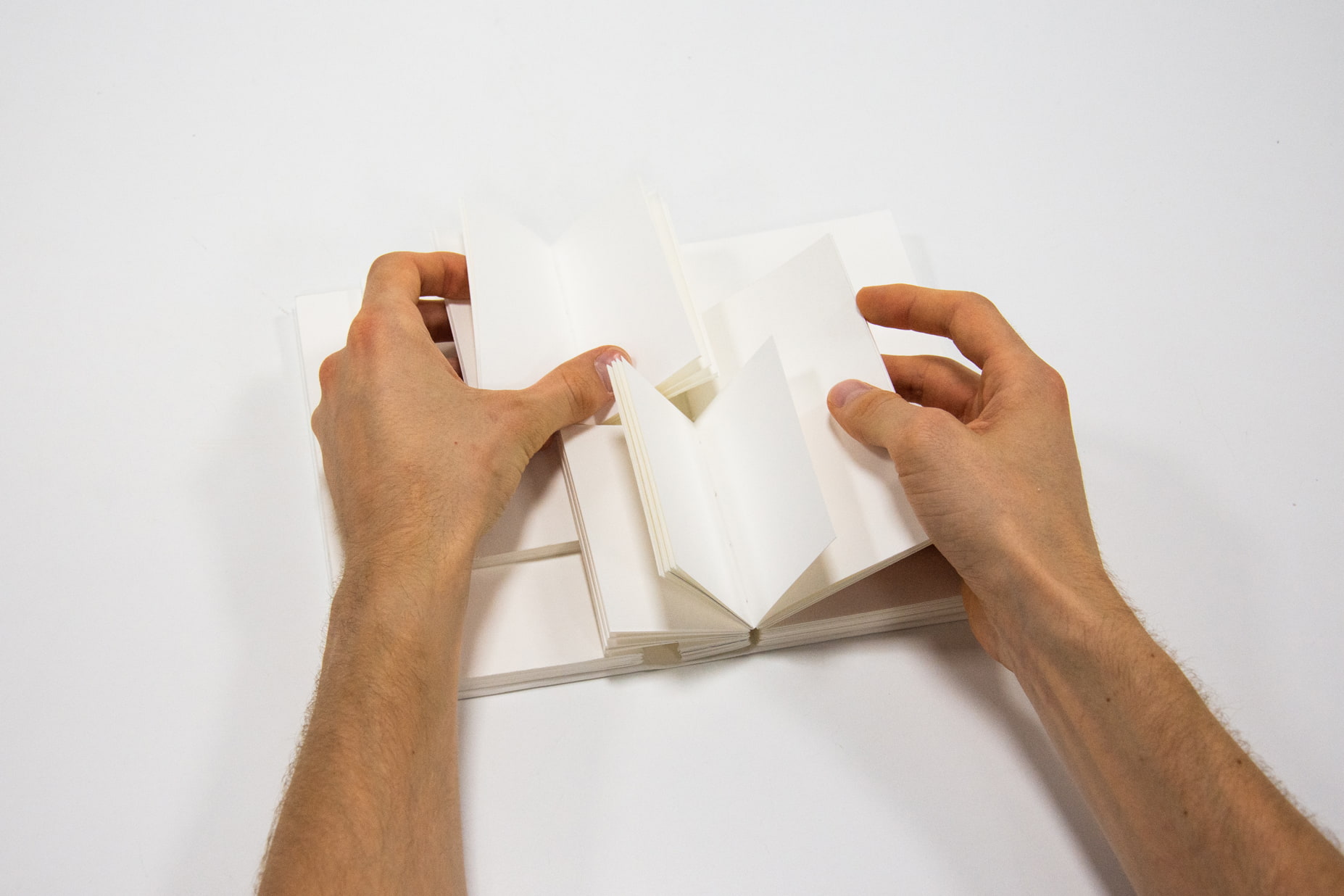 and content to emphasise the role of the physical, these books try to communicate a randomly picked theme, word,
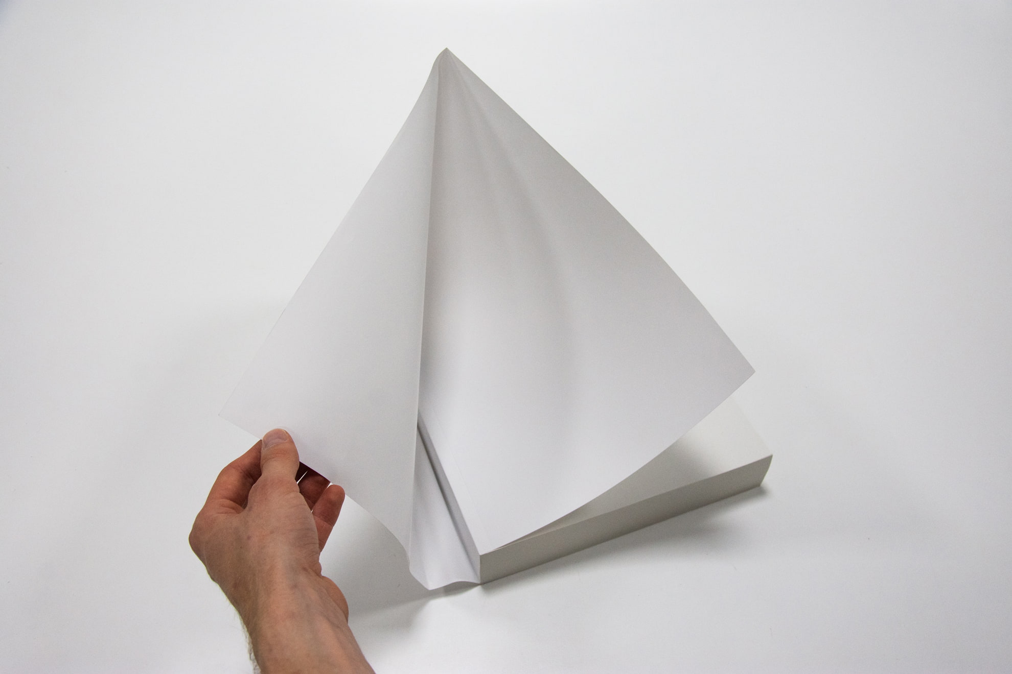 or phrase only by using the paper, binding, and form.
 that together define what meaning or feeling that category, and in turn the book, emits.
 . These infographics visualise the individual characteristics of the 3 categories, and in turn,
show my thought process and design choices when aiming to emit
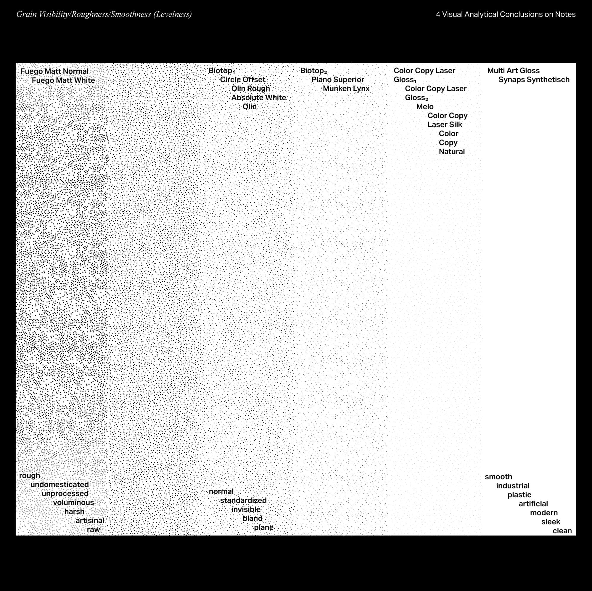 certain meaning or feelings through a book.
 -07.jpg) based on its properties. With these visualisations I have created a
based on its properties. With these visualisations I have created a
-04.jpg) tool for myself that can be referred to later in my graphic and book design practice.
tool for myself that can be referred to later in my graphic and book design practice.